Day 1 PM: Visualizing data with ggplot2
In [1]:
suppressPackageStartupMessages(library(tidyverse))
Warning message:
“Installed Rcpp (0.12.12) different from Rcpp used to build dplyr (0.12.11).
Please reinstall dplyr to avoid random crashes or undefined behavior.”Warning message:
“package ‘dplyr’ was built under R version 3.4.1”
In [2]:
options(repr.plot.width=6, repr.plot.height=3)
The Grammar of Graphics
When constructing a visualization, we are mapping data elements (annotation, categories, numbers, time series) to visual elements (coordinates, color, size, movement). So the first step in designing a graphic is to decide on
- a data set (usually a
data.framewith observations in rows and variables in columns) - a mapping from date element to visual element (e.g. map height to x-coordinate, weight to y-coordinate, age to color)
- the type of plot(s) desired e.g., bar chart or box plot. Several types can sometimes be overlaid e.g., scatter plot with overlaid linear regression.
After that, we can customize the visual elements in several ways
- direct setting of visual element attributes (size, thickness, color, transparency)
- adding labels (title, subtitle, x-axis label, y-axis label)a
- adding guides (legend, color bar)
- adding annotations (text labels, arrows)
- changing coordinate systems (Cartesian to polar, linear to log)
- changing color scales (color palettes and color maps)
- changing graphic extents (minimum and maximum values displayed)
For global changes to the look and feel of visual elements, we can set styles or themes that simultaneously alter many graphical aspects - background and foreground colors, color scheme, font family used etc.
Sometimes, we need to display multiple plots in a single graphic. To do so, we create a layout that specifies how different plots are related to each other (relative size, sharing of axes). There are two kinds of layouts
- plots are related (i.e. belong to the same data set and type, differ only in choice or subgroup of data elements presented)
- plots are unrelated
Finally, we often need to save the graphic to a file for later viewing or inclusion in a report.
The ggplot2 package provides a grammar to describe these actions
and build them up incrementally, allowing flexible and powerful
construction of informative statistical visualizations.
Example data set 1
In [3]:
head(iris)
| Sepal.Length | Sepal.Width | Petal.Length | Petal.Width | Species |
|---|---|---|---|---|
| 5.1 | 3.5 | 1.4 | 0.2 | setosa |
| 4.9 | 3.0 | 1.4 | 0.2 | setosa |
| 4.7 | 3.2 | 1.3 | 0.2 | setosa |
| 4.6 | 3.1 | 1.5 | 0.2 | setosa |
| 5.0 | 3.6 | 1.4 | 0.2 | setosa |
| 5.4 | 3.9 | 1.7 | 0.4 | setosa |
Mapping with aes
In [4]:
g <- ggplot(iris, aes(x=Sepal.Length, y=Sepal.Width,
                      color=Species, fill=Species))
g

Plots with geom
In [5]:
g <- g + geom_point()
g

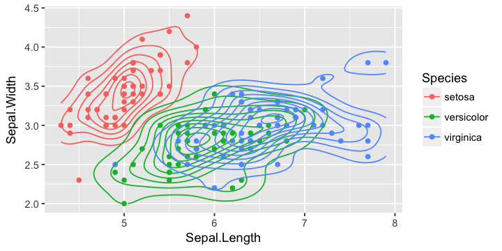
In [6]:
g + geom_density_2d()
In [7]:
g +
geom_smooth()
`geom_smooth()` using method = 'loess'

In [8]:
g +
geom_smooth(method=`lm`)

Change of coord
In [9]:
g + geom_point(aes(size=Sepal.Width), alpha=0.5) +
coord_polar()

Change of scale
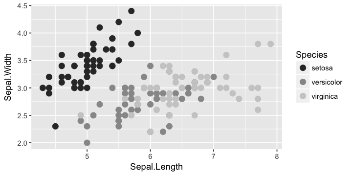
In [10]:
g + geom_point(size=3) + scale_color_grey()
Facets
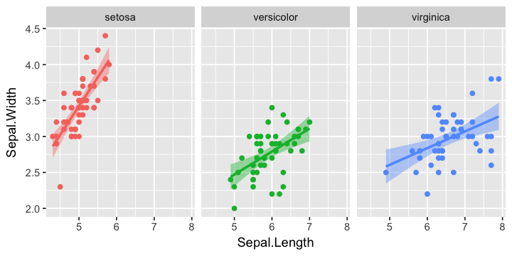
In [11]:
g +
geom_smooth(method='lm') +
facet_wrap(~ Species) +
guides(color=F, fill=F)
Preview of data manipulation
In [12]:
ggplot(iris %>% gather(measure, value, -Species),
      aes(x=value, fill=Species, color=Species)) +
facet_wrap(~ measure, ncol=2, scales = "free") +
geom_density(alpha=0.5)

Themes
In [13]:
g +
geom_smooth(method='lm') +
facet_wrap(~ Species) +
guides(color=F, fill=F) +
theme_classic()

Example data set 2
Australian AIDS Survival Data
URL: https://raw.github.com/vincentarelbundock/Rdatasets/master/csv/MASS/Aids2.csv
This data frame contains 2843 rows and the following columns:
state
Grouped state of origin: “NSW “includes ACT and “other” is WA, SA, NT and TAS.
sex
Sex of patient.
diag
(Julian) date of diagnosis.
death
(Julian) date of death or end of observation.
status
“A” (alive) or “D” (dead) at end of observation.
T.categ
Reported transmission category.
age
Age (years) at diagnosis.
Note: Julian dates are simply a continuous count of days and fractions since noon Universal Time on January 1, 4713 BC.
In [14]:
url <- "https://raw.github.com/vincentarelbundock/Rdatasets/master/csv/MASS/Aids2.csv"
df <- read.csv(url)
Preview of data manipulation
In [15]:
df <- df %>% mutate(surv = death - diag)
In [16]:
head(df)
| X | state | sex | diag | death | status | T.categ | age | surv |
|---|---|---|---|---|---|---|---|---|
| 1 | NSW | M | 10905 | 11081 | D | hs | 35 | 176 |
| 2 | NSW | M | 11029 | 11096 | D | hs | 53 | 67 |
| 3 | NSW | M | 9551 | 9983 | D | hs | 42 | 432 |
| 4 | NSW | M | 9577 | 9654 | D | haem | 44 | 77 |
| 5 | NSW | M | 10015 | 10290 | D | hs | 39 | 275 |
| 6 | NSW | M | 9971 | 10344 | D | hs | 36 | 373 |
In [17]:
str(df)
'data.frame':   2843 obs. of  9 variables:
 $ X      : int  1 2 3 4 5 6 7 8 9 10 ...
 $ state  : Factor w/ 4 levels "NSW","Other",..: 1 1 1 1 1 1 1 1 1 1 ...
 $ sex    : Factor w/ 2 levels "F","M": 2 2 2 2 2 2 2 2 2 2 ...
 $ diag   : int  10905 11029 9551 9577 10015 9971 10746 10042 10464 10439 ...
 $ death  : int  11081 11096 9983 9654 10290 10344 11135 11069 10956 10873 ...
 $ status : Factor w/ 2 levels "A","D": 2 2 2 2 2 2 2 2 2 2 ...
 $ T.categ: Factor w/ 8 levels "blood","haem",..: 4 4 4 2 4 4 8 4 4 5 ...
 $ age    : int  35 53 42 44 39 36 36 31 26 27 ...
 $ surv   : int  176 67 432 77 275 373 389 1027 492 434 ...
Mapping with aes
In [18]:
g1 <- ggplot(df, aes(x=T.categ, y=surv, color=sex, fill=sex))
g1

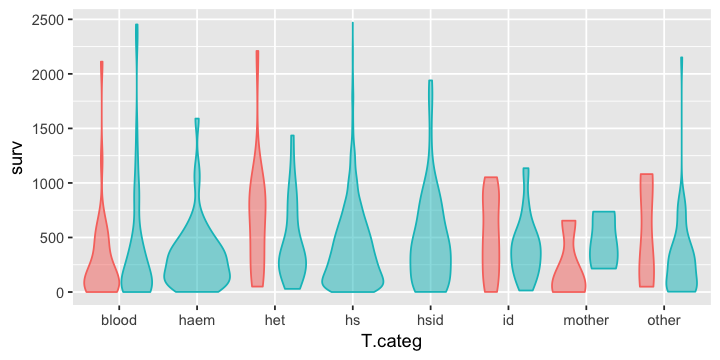
Plotting with geom
In [19]:
g1 + geom_boxplot()

In [20]:
g1 + geom_violin()

Graphic attributes
In [21]:
g1 + geom_violin(alpha=0.5, show.legend = F)
Changing coordinates with coord
In [22]:
g1 + geom_violin() + coord_flip()

In [23]:
g1 + geom_violin() + coord_polar()

Grouping with facets
In [24]:
g1 + geom_violin() + facet_wrap(~ state)

In [25]:
g1 + geom_violin() + facet_grid(state ~ status)

Tuning with scale
In [26]:
g1 + geom_violin() + scale_y_log10()
Warning message:
“Transformation introduced infinite values in continuous y-axis”Warning message:
“Removed 29 rows containing non-finite values (stat_ydensity).”

In [27]:
g1 + geom_violin() +
scale_fill_brewer(type="qual", palette=3) +
scale_color_brewer(type="qual", palette=3)

Labels, legends and annotations
In [28]:
g1 + geom_violin() +
labs(x="Transmission category", y="Survival (days)", title="Australian AIDS Survival Data") +
guides(color=F, fill=F)

Layout and themes
In [29]:
g1 + geom_violin() +
theme_classic()

In [30]:
g1 + geom_violin() +
theme_linedraw()

Raster plots
In [31]:
library(genefilter)

n <- 20
m <- 50000
EXPRS <- matrix(rnorm(m * 2 * n), m, 2*n)
rownames(EXPRS) <- paste('g', 1:m, sep='')
colnames(EXPRS) <- paste('pt', 1:(2*n), sep='')
grp <- as.factor(rep(c("Control", "Treated"), each=n))

p.values <- rowttests(EXPRS, grp)$p.value
ii <- order(p.values)
TOPEXPRS <- EXPRS[ii[1:100], ]

M <- data.frame(t(TOPEXPRS)) %>% rownames_to_column("pid") %>% gather(gene, expression, -pid)
Attaching package: ‘genefilter’

The following object is masked from ‘package:readr’:

    spec
In [32]:
head(M)
| pid | gene | expression |
|---|---|---|
| pt1 | g1980 | -0.1082628 |
| pt2 | g1980 | -0.6817481 |
| pt3 | g1980 | -0.6059883 |
| pt4 | g1980 | 0.3678514 |
| pt5 | g1980 | -1.2181737 |
| pt6 | g1980 | -0.2223193 |
In [33]:
g2 <- ggplot(M, aes(gene, pid, fill=expression)) +
      geom_tile(colour='white') +
      theme(axis.text.x = element_blank(),
            axis.text.y = element_blank(),
            axis.ticks.x = element_blank(),
            axis.ticks.y = element_blank())
g2

In [34]:
g3 <- g2 + scale_fill_gradient(low = "white", high="red")
g3

Saving figures
In [35]:
ggsave("figs/iris.png", g)
Saving 7 x 7 in image
In [42]:
ggsave("figs/mtcars.pdf", g1, width=4, height=3)
In [48]:
ggsave("figs/expr.jpg", g2, scale = 0.5, width=8, height=4, dpi = 300)
