SMITHSONIAN METEORITE EXHIBIT
Some Observations on the Design of the Exhibit Relevant to a Smaller Space (updated 1/22/2011) |
||
The main elements of the Smithsonian display gallery are:
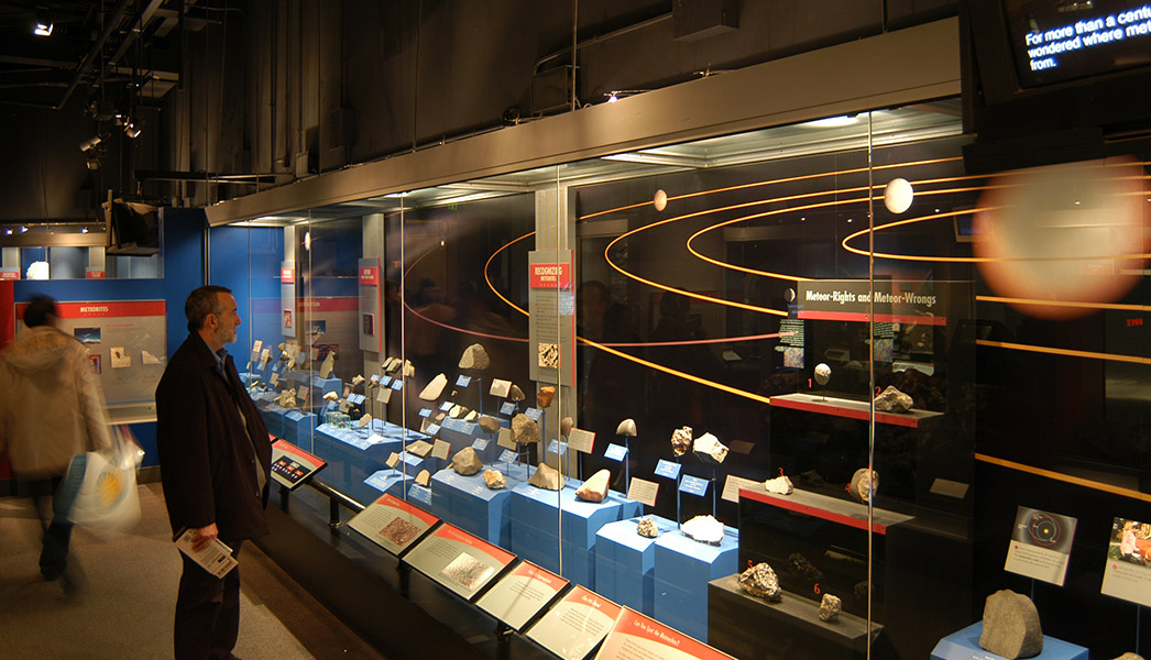
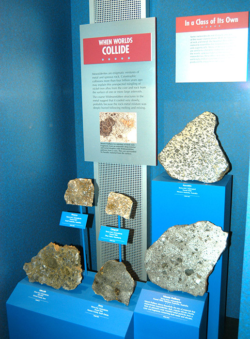
Most meteorites lack color and bold patternings. They are, quite bluntly, visually drab. In order to make them stand out visually, to make them grab our attention, we need to create a larger environment in which to place them which is even more drab and less visually interesting. Therefore, the colors surrounding a meteorite should be neutral, gray or dark and certainly less saturated with color than the meteorites on display. Where the meteorite does exhibit bold patternings, either in its carefully lit Widmanstatten pattern or in the contrasting shadows and highlights of its abladed surface, we can depart somewhat from the above. I would take issue of their choice of bright blue stands and boxes in displaying features such as orientation and flight markings (see below). Spot-lights accentuating these features with a neutral tan or gray background could have better served these meteorites. A great improvement could be made with more appropriate lighting. |
||
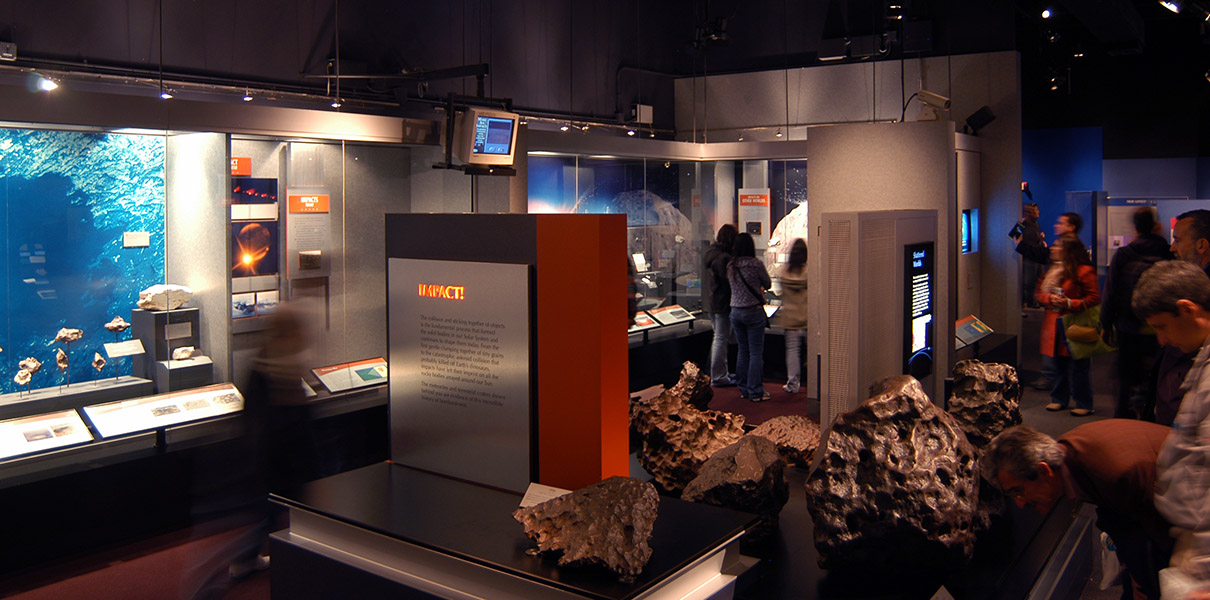 The gallery has had its drop-down ceiling removed and all pipes, ducts, supports and conduits have been painted flat black. This gives the dramatic impression of an infinitely deep night sky and focuses attention on spot-lit displays and back-lit graphics. Ambient colors are unsaturated to give the gray and ochre color of meteorites dominance. Two key primary colors have been chosen carefully for accent: orange-red accenting the fiery luminance of hot gasses and blue accenting both ocean and sky. |
||
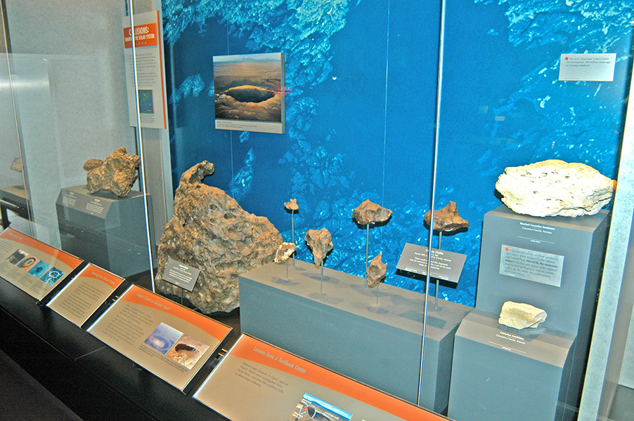
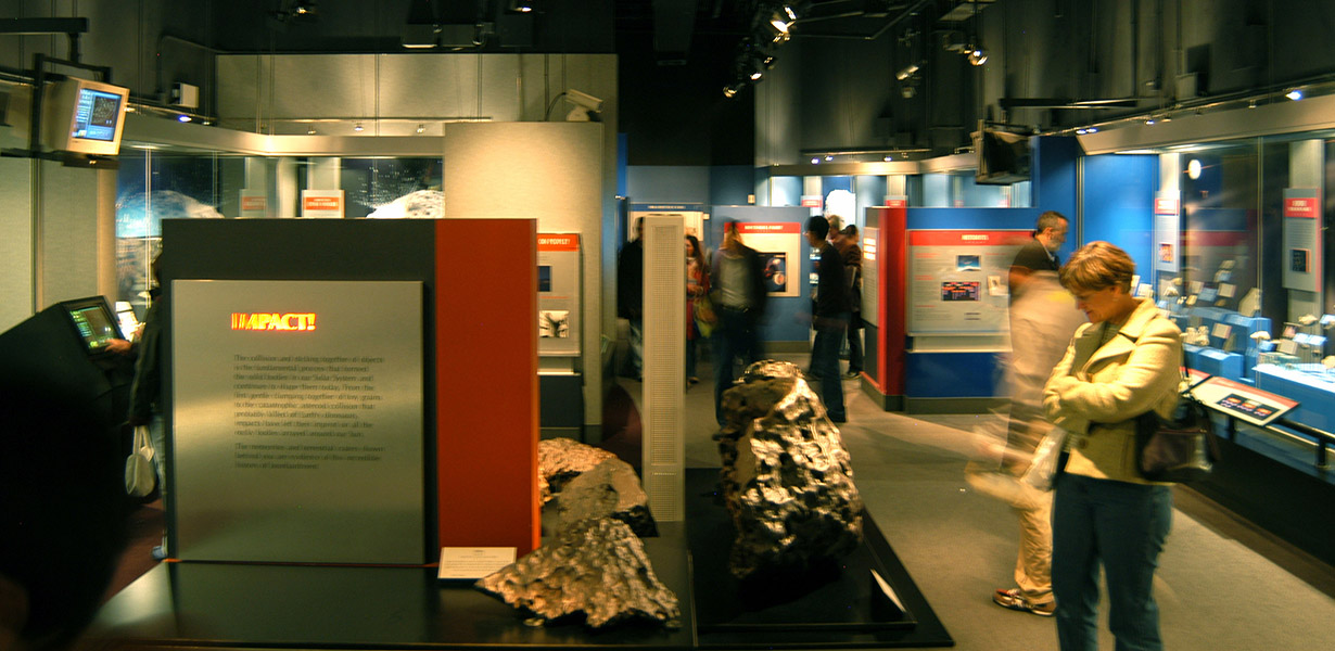 Multiple scales of display are intermixed with large irons inviting touch and small pieces securely behind glass. Pathways are offset, giving the impression of fullness. Note the impact of active titling, e.g. "IMPACT!" |
||
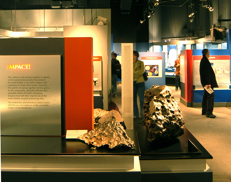 The overall design is reminiscent of a Mondrian composition. |
||
 Large graphics attract attention to small artifacts mounted on blocks and rods of different heights. The sans-serif type face is informal and unthreatening. I've found the use of Comic Sans quite useful in making seeming distant computer programming concepts more friendly. All of the text on this page was written in Comic Sans and should show up as such if your browser is set correctly |
||
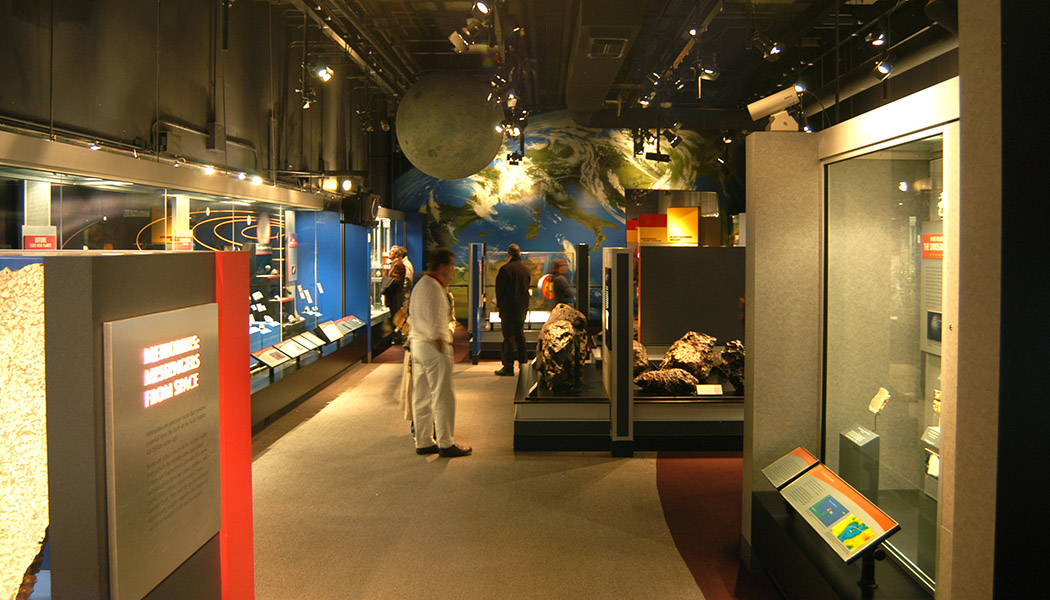 The globe in the ceiling penetrates into the display space and the distant image of Earth add to the illusion of being in the Cosmos. |
||
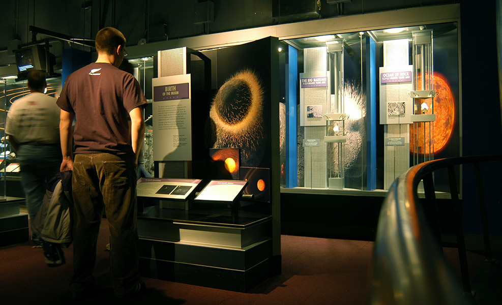 Brushed aluminum provides the high-tech look of space exploration, the Moon rocks being displayed in the muted cool gray case with blue accents. |
||
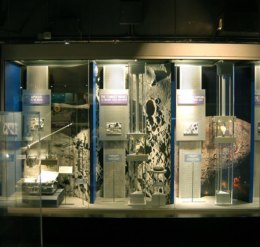 80/20 extruded materials would be well suited to replicating this look. The white metal tones complement the colorless surface of the Moon. Again, large graphics draw the observer in for a closer look at the small rocks. Strong vertical lines emphasize height and the large black background areas further serve to float the case in the dark vacuum of space. |
||
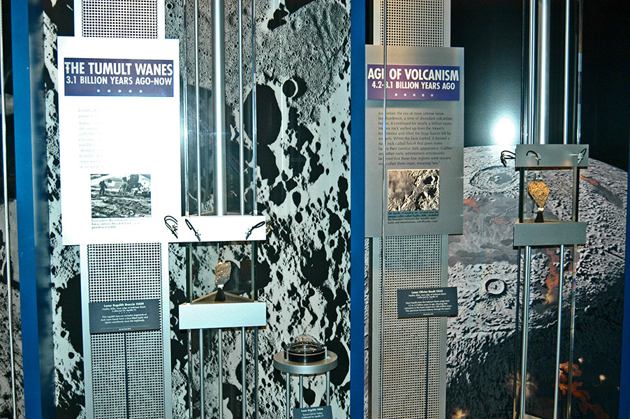 Closeup of the individually lit jewelery-like treatment of the Moon rocks held in a case within a case. |
||
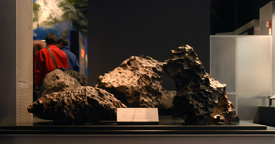
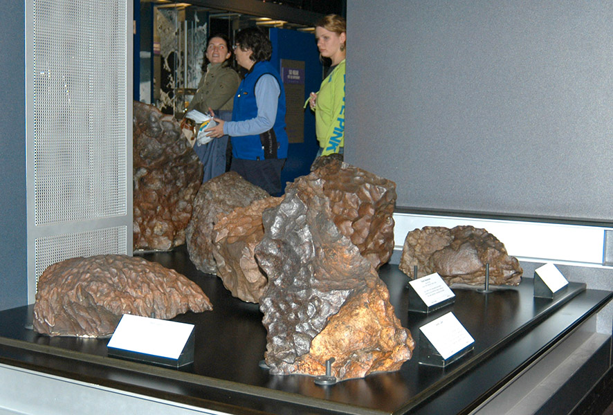 Irons, visible from many locations in the gallery, invite intimate "touch." |
||
 Irons, visible from many locations in the gallery, invite intimate "touch." |
||
 Meteorites on the ground, meteorites on sticks, meteorites on boxes provide visual variety. |
||
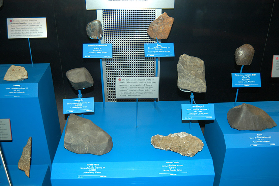 Perhaps the saturated blue attracts attention, but it washes out the subtle detail of unsaturated meteorites. The aluminum information labels stand out brilliantly, but have been muted in PhotoShop for overall image clarity. Spot lighting would improve the display. |
||
 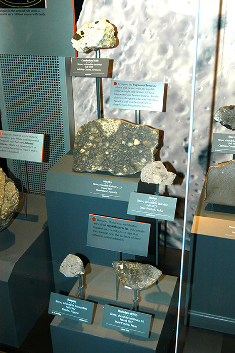 Compare and contrast the use (or misuse) of color in these two displays. <<< At left, the bright blue makes the meteorites appear drab despite their metallic scheen. At right, the use of subdued unsaturated color makes the characteristics of the meteorites stand out. >>> |
||