
Get to know your data
Data sources and units
Draw the picture
Data sources and units: Before you even
begin to analyze your data, you should ask:
-
Where did it come from? (How was it originally recorded? By whom? How
frequently?
Under what conditions?)
-
Where has it been? (What other systems has it passed through? How has
it
been adjusted, aggregated, averaged, or otherwise massaged?)
-
Is it clean or dirty? (Are there data entry errors? Missing data?
Misalignment
of time periods? Changes in reporting practices? Bizarre events?) And
last
but not least...
-
In what units is it measured? (Has it been seasonally adjusted
,
and if so, how? Is it measured in monthly totals or an annual rate? In
nominal or constant (inflation-adjusted) units of currency? Does it
represent the current level
of something, or does it represent the
absolute change from one
period to another, or the percentage change from one period to
another?
Are the units consistent from one variable to another?)
Later, when you write up the
results of your analysis, the variables in
your data set should be clearly annotated to indicate their sources,
units
of measurement, and any problems or peculiarities you are aware of.
The bad news here is that
assembling, cleaning, adjusting, and documenting
the units of the data is often the most tedious step of forecasting,
and
failure to attend to these mundane details may lead to egregious errors
of modeling. The good news is that you often learn a good deal in the
process,
gaining insight into the trends and forces which are influencing the
variables
you wish to predict.
You may also find that the most
important management benefit of your
forecasting project is to identify ways in which your organization's
data
can be better collected, better organized, better integrated, and
better
summarized for purposes of decision-making.
Draw
the #!*$ picture: Before you
crunch a single
number, you should graph your
data to get a feel for its
qualititative
properties. For example, suppose you are analyzing retail sales in the
US auto industry. Here's a time series plot of retail sales at
automotive
dealers taken from the retail database in Datadisk (an economic
database
system that we used prior to Economagic):
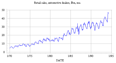
Note that data are in
billions of dollars, not seasonally adjusted,
or "nsa." (The series title was copied from original data source
and pasted into the graph title area in Statgraphics.)
What qualitative features
are evident on this graph? You might notice
some of the following:
A forecasting model for this
time series must accomodate all these qualititative
features, and ideally it should shed light on their underlying causes.
To study these features of the time series in more depth, and to help
determine
which kind of forecasting model is most appropriate, we should next
plot
some transformations
of the original data.