Statistics review 1: Presenting and summarising data
R code to accompany paper
Key learning points
- The first step in any analysis is to describe and summarize the data
- Understand the following
- qualitative data (unordered and ordered) and quantitative data (discrete and continuous)
- how these types of data can be represented figuratively
- the two important features of a quantitative dataset (location and variability)
- the measures of location (mean, median and mode)
- the measures of variability (range, interquartile range, standard deviation and variance)
- common distributions of clinical data
- simple transformations of positively skewed data.
suppressPackageStartupMessages(library(tidyverse))
Set default plot size to 4” by 3”
options(repr.plot.width=4, repr.plot.height=3)
Summary Statistics
df1 <- read.csv('data/haemoglobin.csv', header=FALSE, col.names=c("hb"))
Working with data frames
class(df1)
head(df1)
| hb |
|---|
| 5.4 |
| 8.2 |
| 6.4 |
| 8.3 |
| 6.4 |
| 8.3 |
str(df1)
'data.frame':       48 obs. of  1 variable:
 $ hb: num  5.4 8.2 6.4 8.3 6.4 8.3 7 8.6 7.1 8.8 ...
dim(df1)
- 48
- 1
summary(df1)
      hb
Min.   : 5.400
1st Qu.: 8.750
Median : 9.800
Mean   : 9.869
3rd Qu.:10.800
Max.   :14.100
Dataframe indexing
df1$hb
- 5.4
- 8.2
- 6.4
- 8.3
- 6.4
- 8.3
- 7
- 8.6
- 7.1
- 8.8
- 7.3
- 8.9
- 7.7
- 9.1
- 8.1
- 9.3
- 9.3
- 9.9
- 9.4
- 9.9
- 9.4
- 9.9
- 9.4
- 10.1
- 9.4
- 10.3
- 9.5
- 10.3
- 9.7
- 10.4
- 9.7
- 10.4
- 10.5
- 11.9
- 10.5
- 12.3
- 10.6
- 12.6
- 10.8
- 12.7
- 10.8
- 13
- 11.3
- 13.3
- 11.7
- 14
- 11.7
- 14.1
df1[,1]
- 5.4
- 8.2
- 6.4
- 8.3
- 6.4
- 8.3
- 7
- 8.6
- 7.1
- 8.8
- 7.3
- 8.9
- 7.7
- 9.1
- 8.1
- 9.3
- 9.3
- 9.9
- 9.4
- 9.9
- 9.4
- 9.9
- 9.4
- 10.1
- 9.4
- 10.3
- 9.5
- 10.3
- 9.7
- 10.4
- 9.7
- 10.4
- 10.5
- 11.9
- 10.5
- 12.3
- 10.6
- 12.6
- 10.8
- 12.7
- 10.8
- 13
- 11.3
- 13.3
- 11.7
- 14
- 11.7
- 14.1
df1[1,]
df1[5:10,]
- 6.4
- 8.3
- 7
- 8.6
- 7.1
- 8.8
Measuring location
Using built-in functions
df1 %>% summarize(mean=mean(hb), median=median(hb), mode=mode(hb))
| mean | median | mode |
|---|---|---|
| 9.86875 | 9.8 | numeric |
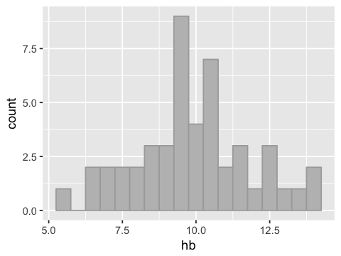
Visualizing the data distribution
ggplot(df1, aes(x=hb)) +
geom_histogram(binwidth=0.5, fill="grey", color="darkgrey")
Measuring variability
range(df1$hb)
- 5.4
- 14.1
quantile(df1$hb, c(0.25, 0.75))
- 25%
- 8.75
- 75%
- 10.8
sd(df1$hb)
var(df1$hb)
df1 %>% summarize(min=min(hb),
                 max=max(hb),
                 iqr=quantile(hb, 0.75)- quantile(hb, 0.25),
                 sd=sd(hb),
                 var=var(hb))
| min | max | iqr | sd | var |
|---|---|---|---|---|
| 5.4 | 14.1 | 2.05 | 1.972918 | 3.892407 |
Using a convenience function
summary(df1)
      hb
Min.   : 5.400
1st Qu.: 8.750
Median : 9.800
Mean   : 9.869
3rd Qu.:10.800
Max.   :14.100
Common distributions and simple transformations
Exercise. Read in the urea.csv data file into a data frame
df2 and name the column urea.
df2 <- read.csv("data/urea.csv", header=FALSE, col.names=c("urea"))
head(df2, n=3)
| urea |
|---|
| 16.007049 |
| 13.647212 |
| 6.653046 |
g <- ggplot(df2, aes(x=urea))
g <- g + geom_histogram(binwidth=1, fill="grey", color="darkgrey")
g
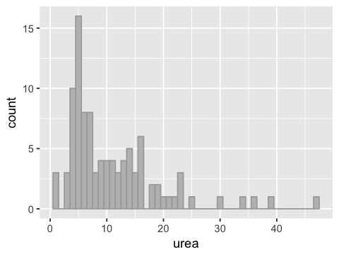
Skewness
We say the data has a positive or right skew. This name comes from the fact that there is a statistical measure called skewness that is positive for long right tails, and negative for long left tails.
install.packages("e1071", repos = "http://cran.r-project.org")
library(e1071)
The downloaded binary packages are in
    /var/folders/3l/tbmzdkss71152d8t9n1f8nx40000gn/T//RtmpdeIh9P/downloaded_packages
skewness(df2$urea)
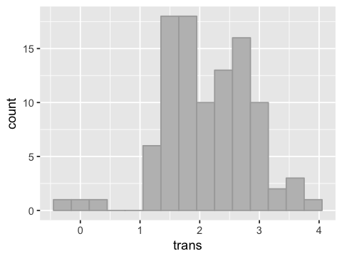
Log transform of the data
df2['trans'] = log(df2['urea'])
g <- ggplot(df2, aes(x=trans))
g <- g + geom_histogram(binwidth=0.3, fill="grey", color="darkgrey")
g
head(df2)
| urea | trans |
|---|---|
| 16.007049 | 2.773029 |
| 13.647212 | 2.613535 |
| 6.653046 | 1.895075 |
| 5.107674 | 1.630744 |
| 19.325193 | 2.961410 |
| 10.141074 | 2.316594 |
Finding geometric mean
gm  <- function(x) {
    return(exp(mean(log(x))))
}
df2 %>% summarise(mean=mean(urea), geom.mean=gm(urea))
| mean | geom.mean |
|---|---|
| 10.97242 | 8.504802 |
Exercise
1 Load the file “ph.csv” into a data frame called df. Label the
column ph.
2. Plot a histogram of the data. Calculate the skewness of the
ph column.
3 Left skewed data can sometimes be made more “normal” by an
exponential transformation. That is, if the original data is \(x\),
the transformed data is \(e^x\). Create another column named
trasn with the transformed data.
4. Plot a histogram of the transformed data.
5 Write your own function called sr.sd to calculate the standard
deviation using the formula in Table 3.
6. Create a new table using the summarise function with the mean
and standard deviation of both original and transformed data values.
This data frame should have 1 row and 4 columns named orig.mean,
orig.sd, trans.mean, trans.sd.