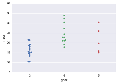
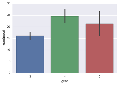
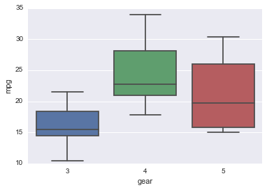
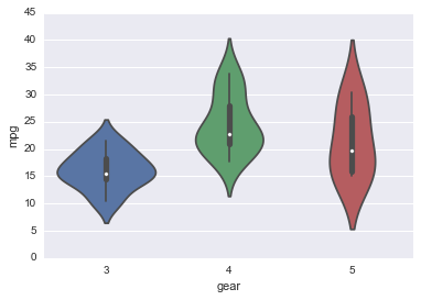
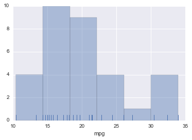
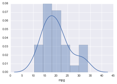
In [1]:
import numpy as np
import pandas as pd
import matplotlib
import matplotlib.pyplot as plt
import seaborn as sns
%matplotlib inline
Types of Plots
In [2]:
import warnings
warnings.filterwarnings("ignore")
In [3]:
url = 'http://bit.ly/2b72LNj'
df = pd.read_csv(url)
In [4]:
df.head()
Out[4]:
| model | mpg | cyl | disp | hp | drat | wt | qsec | vs | am | gear | carb | |
|---|---|---|---|---|---|---|---|---|---|---|---|---|
| 0 | Mazda RX4 | 21.0 | 6 | 160.0 | 110 | 3.90 | 2.620 | 16.46 | 0 | 1 | 4 | 4 |
| 1 | Mazda RX4 Wag | 21.0 | 6 | 160.0 | 110 | 3.90 | 2.875 | 17.02 | 0 | 1 | 4 | 4 |
| 2 | Datsun 710 | 22.8 | 4 | 108.0 | 93 | 3.85 | 2.320 | 18.61 | 1 | 1 | 4 | 1 |
| 3 | Hornet 4 Drive | 21.4 | 6 | 258.0 | 110 | 3.08 | 3.215 | 19.44 | 1 | 0 | 3 | 1 |
| 4 | Hornet Sportabout | 18.7 | 8 | 360.0 | 175 | 3.15 | 3.440 | 17.02 | 0 | 0 | 3 | 2 |
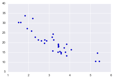
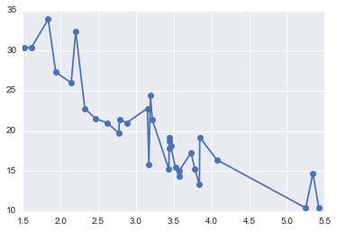
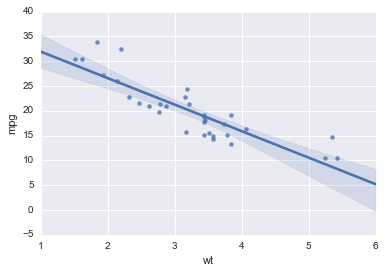
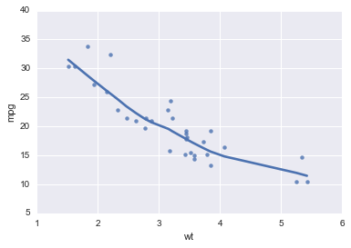
Fitting a regression line
Heatmap
In [15]:
import string
In [16]:
nrows = 20
ncols = 20
row_names = range(1970, 1970 + nrows)
col_names = [string.ascii_lowercase[i:i+5] for i in range(ncols)]
values = np.random.random((nrows, ncols))
In [17]:
df = pd.DataFrame(values, index = row_names, columns = col_names)
In [18]:
sns.heatmap(df)
pass
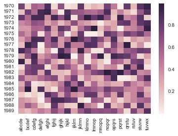
In [19]:
cmap = sns.light_palette('red', as_cmap=True)
g = sns.clustermap(df, cmap = cmap)
plt.setp(g.ax_heatmap.yaxis.get_majorticklabels(), rotation=0)
pass
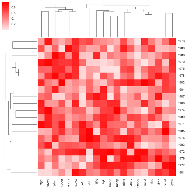
Exercises
In [20]:
subjects = pd.read_excel('data/capstone1/HIV Boot Camp.xls', sheetname='Patient Information')
In [21]:
subjects.head()
Out[21]:
| ID | AGE | RACE | SEX | MSM | IDU | UNC Entry to Care Year | Prior HIV Care Elsewhere | On ART | ART Type | |
|---|---|---|---|---|---|---|---|---|---|---|
| 0 | 1 | 38 | AMIND | F | No | No | 2012 | NO | Yes | Integrase |
| 1 | 2 | 44 | AMIND | F | No | No | 2006 | YES | No | NaN |
| 2 | 3 | 33 | AMIND | F | No | No | 2005 | NO | No | NaN |
| 3 | 4 | 60 | AMIND | F | No | Yes | 2003 | NO | Yes | Integrase |
| 4 | 6 | 47 | AMIND | F | No | No | 2001 | YES | Yes | Other |
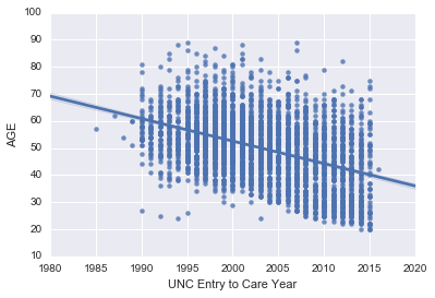
1. Make a linear regression plot of AGE by
UNC Entry to Care Year. Is there any trend over time that you can
observe?
In [22]:
sns.regplot(data=subjects, y='AGE', x='UNC Entry to Care Year')
pass
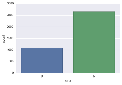
2. Chcek the help documentaion for sns.countplot. Then create a
barchart of the count of the number of people by SEX.
In [23]:
sns.countplot(data=subjects, x='SEX')
pass
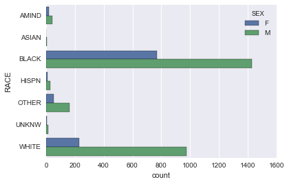
3. Make a horizontal stacked barchart of the count of the number of
people by RACE and color by SEX. As before, look up help on
sns.countplot to do so.
In [24]:
sns.countplot(data=subjects, y='RACE', hue='SEX')
pass
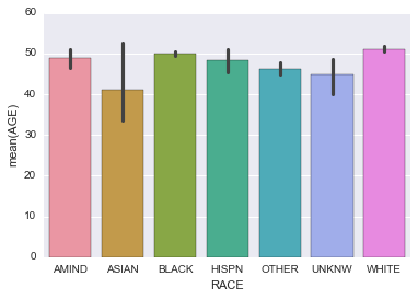
4. Make a barchart of the AGE of people by RACE.
In [25]:
sns.barplot(data=subjects, x='RACE', y='AGE')
pass
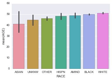
5. Make a barchart of the AGE of people by RACE, but arrange in order of increasing average age. To do so, you need to give the order argument a list of strings containing the sequnce of RACE desired.
Bonus: (More challenging) Try to get the list of strings using
pandas rather than manually.
In [26]:
sns.barplot(data=subjects, x='RACE', y='AGE',
            order=subjects.groupby('RACE').mean().sort_values('AGE').index)
pass
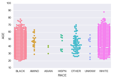
6 Make a swarm plot of the AGE by RACE but only for subejcts who have MSM status equal to ‘Yes’.
In [27]:
sns.swarmplot(data=subjects[subjects.MSM=='Yes'], x='RACE', y='AGE')
pass
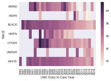
7. (Challenging) Make a heat map of the mean AGE where the rows correspond to RACe and the columns to ‘UNC Entry to Care Year’.
Hint: Look up the pivot_table method of pandas DataFrames.
In [28]:
data = subjects.pivot_table(index='RACE', columns='UNC Entry to Care Year', values='AGE')
In [29]:
sns.heatmap(data)
pass
In [ ]:
