In [1]:
import numpy as np
import pandas as pd
import matplotlib
import matplotlib.pyplot as plt
import seaborn as sns
%matplotlib inline

%load_ext version_information
%load_ext rpy2.ipython
Customizing Plots
In [2]:
url = 'http://bit.ly/2b72LNj'
df = pd.read_csv(url)
In [3]:
df.head()
Out[3]:
| model | mpg | cyl | disp | hp | drat | wt | qsec | vs | am | gear | carb | |
|---|---|---|---|---|---|---|---|---|---|---|---|---|
| 0 | Mazda RX4 | 21.0 | 6 | 160.0 | 110 | 3.90 | 2.620 | 16.46 | 0 | 1 | 4 | 4 |
| 1 | Mazda RX4 Wag | 21.0 | 6 | 160.0 | 110 | 3.90 | 2.875 | 17.02 | 0 | 1 | 4 | 4 |
| 2 | Datsun 710 | 22.8 | 4 | 108.0 | 93 | 3.85 | 2.320 | 18.61 | 1 | 1 | 4 | 1 |
| 3 | Hornet 4 Drive | 21.4 | 6 | 258.0 | 110 | 3.08 | 3.215 | 19.44 | 1 | 0 | 3 | 1 |
| 4 | Hornet Sportabout | 18.7 | 8 | 360.0 | 175 | 3.15 | 3.440 | 17.02 | 0 | 0 | 3 | 2 |
Customizing matplotllib graphics
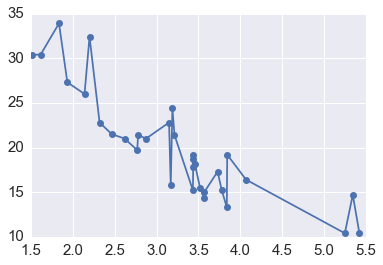
In [4]:
plt.plot('wt', 'mpg', '-o', data = df.sort_values('wt'))
pass
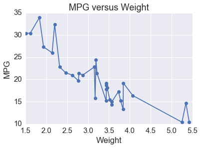
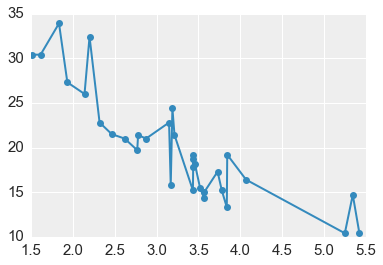
Adding labels
In [5]:
plt.plot('wt', 'mpg', '-o', data = df.sort_values('wt'))
plt.title('MPG versus Weight')
plt.xlabel('Weight')
plt.ylabel('MPG')
pass
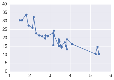
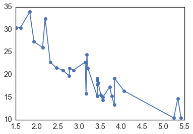
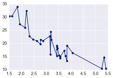
Changing Axes Limits
In [6]:
plt.plot('wt', 'mpg', '-o', data = df.sort_values('wt'))
plt.xlim([1, 6])
plt.ylim([0, 40])

pass
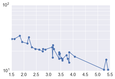
Changing coordinate systems
In [7]:
plt.plot('wt', 'mpg', '-o', data = df.sort_values('wt'))
plt.yscale("log")
plt.yticks(np.linspace(10, 100, 10))
pass
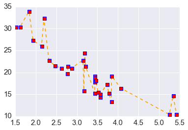
Changing attributes of visual eleemnets
In [8]:
plt.plot('wt', 'mpg', color = 'orange', linestyle = 'dashed',
         marker = 's', mec = 'blue', mew = 1, mfc = 'red',
         data = df.sort_values('wt'))
pass
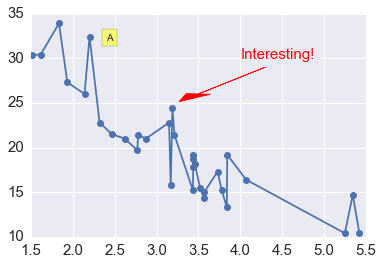
Adding annotations
In [9]:
plt.plot('wt', 'mpg', '-o', data = df.sort_values('wt'))
plt.text(4.0, 30.0, 'Interesting!', fontsize = 15, color = 'red')
plt.text(2.4, 32, 'A', bbox = dict(facecolor='yellow', alpha =0.5))
plt.arrow(4.3, 29, -0.80, -3, head_length = 0.9, head_width = 0.3, fc='r', ec='r', lw =0.75)
pass
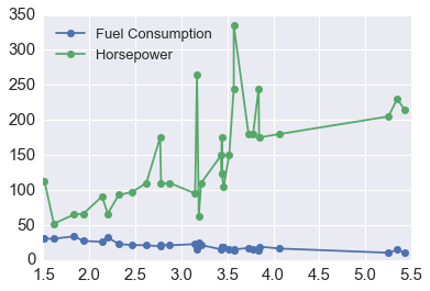
Adding legends
In [10]:
plt.plot('wt', 'mpg', '-o', data = df.sort_values('wt'), label = 'Fuel Consumption')
plt.plot('wt', 'hp', '-o', data = df.sort_values('wt'), label = 'Horsepower')
plt.legend(loc = 'upper left', fontsize = 13)
pass
Using styles
In [11]:
plt.style.available
Out[11]:
['classic',
 'seaborn-whitegrid',
 'bmh',
 'seaborn-paper',
 'ggplot',
 'seaborn-pastel',
 'seaborn-notebook',
 'seaborn-ticks',
 'seaborn-dark-palette',
 'seaborn-white',
 'seaborn-darkgrid',
 'dark_background',
 'grayscale',
 'fivethirtyeight',
 'seaborn-colorblind',
 'seaborn-talk',
 'seaborn-poster',
 'seaborn-deep',
 'seaborn-bright',
 'seaborn-muted',
 'seaborn-dark',
 'presentation']
In [12]:
with plt.style.context('seaborn-white'):
    plt.plot('wt', 'mpg', '-o', data = df.sort_values('wt'))
In [13]:
with plt.style.context('seaborn-dark-palette'):
    plt.plot('wt', 'mpg', '-o', data = df.sort_values('wt'))
In [14]:
with plt.style.context('bmh'):
    plt.plot('wt', 'mpg', '-o', data = df.sort_values('wt'))
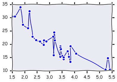
In [15]:
with plt.xkcd():
    plt.plot('wt', 'mpg', '-o', data = df.sort_values('wt'))
Customizing seaborn graphics
Since seaborn is built on top of matplotlib, customization
options for matplotlib will also work with seaborn. However,
seabornn plotting functions often give much more scope for
customization.
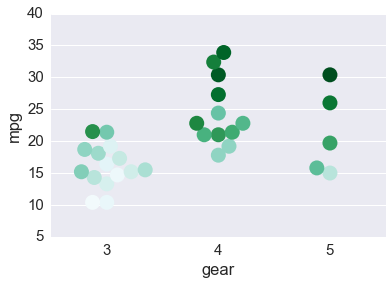
In [16]:
ax = sns.swarmplot('gear', 'mpg', hue = 'wt',
                   size = 15, palette = "BuGn_r",
                   data = df)
ax.legend_.remove()
pass
Layout for Multiple Plots
Data aware grids
In [17]:
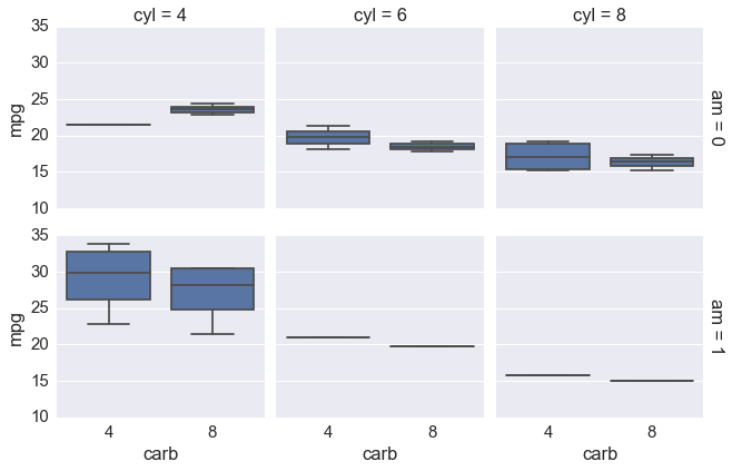
g = sns.FacetGrid(df, row="am", col="cyl", margin_titles=True)
g.map(sns.boxplot, 'carb', 'mpg')
pass
In [18]:
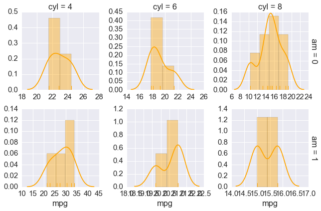
g = sns.FacetGrid(df, row="am", col="cyl", margin_titles=True,
                  sharex = False, sharey = False)
g.map(sns.distplot, 'mpg', rug = True, color = "orange",)
pass
/Users/cliburn/anaconda2/envs/p3/lib/python3.5/site-packages/statsmodels/nonparametric/kdetools.py:20: VisibleDeprecationWarning: using a non-integer number instead of an integer will result in an error in the future
  y = X[:m/2+1] + np.r_[0,X[m/2+1:],0]*1j
Pairwise Plots
In [19]:
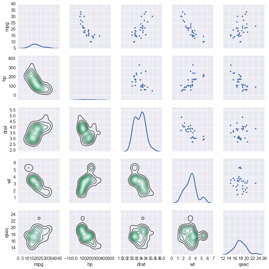
df1 = df[['mpg', 'hp', 'drat', 'wt', 'qsec']]
In [20]:
g = sns.PairGrid(df1)
g.map_upper(plt.scatter)
g.map_lower(sns.kdeplot)
g.map_diag(sns.kdeplot, lw=3, legend=False)
pass
/Users/cliburn/anaconda2/envs/p3/lib/python3.5/site-packages/statsmodels/nonparametric/kdetools.py:20: VisibleDeprecationWarning: using a non-integer number instead of an integer will result in an error in the future
  y = X[:m/2+1] + np.r_[0,X[m/2+1:],0]*1j
Several seaborn plots use these grids under the hood
In [21]:
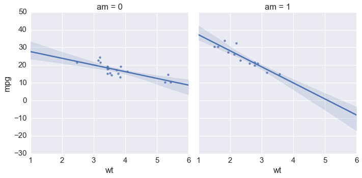
sns.lmplot(x = 'wt', y = 'mpg', col = 'am', data = df)
pass
Laying Out Multiple Different Types of Plots
In [22]:
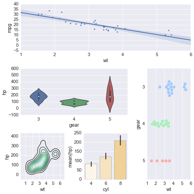
plt.figure(figsize=(9,9))
ax1 = plt.subplot2grid((3,3), (0,0), colspan=3)
ax2 = plt.subplot2grid((3,3), (1,0), colspan=2)
ax3 = plt.subplot2grid((3,3), (1, 2), rowspan=2)
ax4 = plt.subplot2grid((3,3), (2, 0))
ax5 = plt.subplot2grid((3,3), (2, 1))

sns.regplot('wt', 'mpg', data = df, ax = ax1)
sns.violinplot('gear', 'hp', data = df, ax = ax2)
sns.swarmplot('wt', 'gear', data = df, orient = "h",
              size = 10, alpha = 0.8, split = True, palette = 'pastel', ax = ax3)
sns.kdeplot(df.wt, df.hp, ax = ax4)
sns.barplot('cyl', 'hp', data = df,
            palette = sns.light_palette('orange'),  ax = ax5)
plt.tight_layout()
Exercises
1a. Load the iris data set found in data/iris.csv into a
DataFrame named iris.
- How many rows and columns are there in
iris? - Display the first 6 rows.
In [ ]:
1b. Make a regression plot of Sepal.Length (x-coordinate) by
Sepal.Width (y-coordinate) using the lmplot function. Add a title
“Bad regression”.
In [ ]:
1c. Create a new figure where you fit separate linear regressions of Sepal.Length (x-coordinate) by Sepal.Width for each species on the same plot.
In [ ]:
1d. Create a new figure where you have separate linear regression plots of Sepal.Length (x-coordinate) by Sepal.Width for each species. This figure should have 1 row and 3 columns.
In [ ]:
1e Create a new figure with 2 roww and 2 columns, where each figure
shows a swarmplot comparing one of the 4 flower features
(Sepal.Length, Sepal.Width, Petal.Length, Petal.Width) across Species.
Challenge: Can you do this in two lines of code?
In [ ]:
1f. Repeat the exercise in 1e, but change the titles of the subplots to “One” and “Two” for the first row and “Three”, “Four” for the second row.
In [ ]:
Version Information
In [23]:
%load_ext version_information
%version_information
The version_information extension is already loaded. To reload it, use:
  %reload_ext version_information
Out[23]:
| Software | Version |
|---|---|
| Python | 3.5.2 64bit [GCC 4.2.1 Compatible Apple LLVM 4.2 (clang-425.0.28)] |
| IPython | 5.0.0 |
| OS | Darwin 15.6.0 x86_64 i386 64bit |
| Tue Aug 16 09:06:03 2016 EDT | |
In [ ]: