In [1]:
import numpy as np
import pandas as pd
import matplotlib
import matplotlib.pyplot as plt
import seaborn as sns
%matplotlib inline

%load_ext version_information
%load_ext rpy2.ipython
Getting Started With Graphics
When constructing a visualization, we are mapping data elements (annotation, categories, numbers, time series) to visual elements (coordinates, color, size, movement). So the first step in designing a graphic is to decide on
- a data set (usually a
DataFramewith observations in rows and variables in columns) - a mapping (e.g. map height to x-coordinate, weight to y-coordinate, age to color)
- the type of plot(s) desired
- e.g., bar chart or box plot
- several types can sometimes be overlaid e.g., rug plot on density plot
After that, we can customize the visual elements in several ways
- direct setting of visual element attributes (size, thickness, color, transparency)
- adding labels (title, subtitle, x-axis label, y-axis label)a
- adding guides (legend, color bar)
- adding annotations (text labels, arrows)
- changing coordinate systems (Cartesian to polar, linear to log)
- changing color scales (color palettes and color maps)
- changing graphic extents (minimum and maximum values displayed)
For global changes to the look and feel of visual elements, we can set styles or themes that simultaneously alter many graphical aspects - background and foreground colors, color scheme, font family used etc.
Sometimes, we need to display multiple plots in a single graphic. To do so, we create a layout that specifies how different plots are related to each other (relative size, sharing of axes). There are two kinds of layouts
- plots are related (i.e. belong to the same data set and type, differ only in choice or subgroup of data elements presented)
- plots are unrelated
Finally, we often need to save the graphic to a file for later viewing or inclusion in a report.
Resources
Data Set
We will load an example data set for the pulse rate after exercise in an experiment with the following variables
- diet
- low fat
- no fat
- duration of exercise
- 1 min
- 15 min
- 30 min
- condition
- rest
- walking
- running
In [2]:
exercise = sns.load_dataset("exercise", index_col = 0)
In [3]:
exercise.head()
Out[3]:
| id | diet | pulse | time | kind | |
|---|---|---|---|---|---|
| 0 | 1 | low fat | 85 | 1 min | rest |
| 1 | 1 | low fat | 85 | 15 min | rest |
| 2 | 1 | low fat | 88 | 30 min | rest |
| 3 | 2 | low fat | 90 | 1 min | rest |
| 4 | 2 | low fat | 92 | 15 min | rest |
Mapping
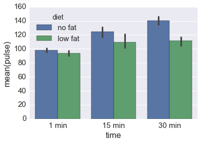
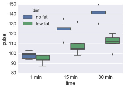
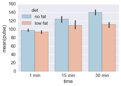
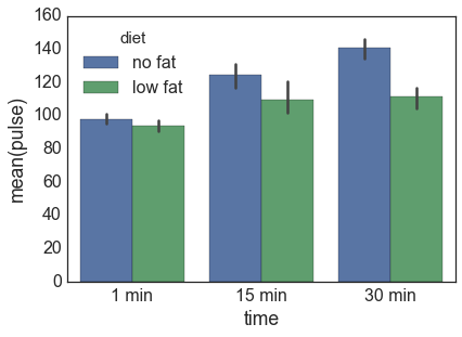
Suppose we are interested in the change in pulse after running for 1, 15 or 30 minutes, and also if the type of diet makes a difference. One way to do this is to map time to the x-coordinate, pulse to the y-coordinate and diet to the color. We do this with several types of plots.
In [4]:
df = exercise[exercise.kind == 'running']
df.head()
Out[4]:
| id | diet | pulse | time | kind | |
|---|---|---|---|---|---|
| 60 | 21 | low fat | 93 | 1 min | running |
| 61 | 21 | low fat | 98 | 15 min | running |
| 62 | 21 | low fat | 110 | 30 min | running |
| 63 | 22 | low fat | 98 | 1 min | running |
| 64 | 22 | low fat | 104 | 15 min | running |
In [5]:
sns.barplot(x = 'time', y = 'pulse', hue = 'diet', data = df)
pass
In [6]:
sns.boxplot(x = 'time', y = 'pulse', hue = 'diet', data = df)
pass
Setting visual elements
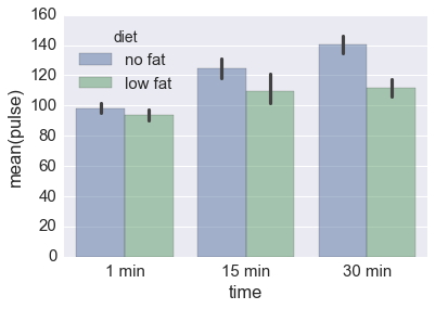
Change transparency
In [7]:
sns.barplot(x = 'time', y = 'pulse', hue = 'diet', data = df,
            alpha = 0.5)
pass
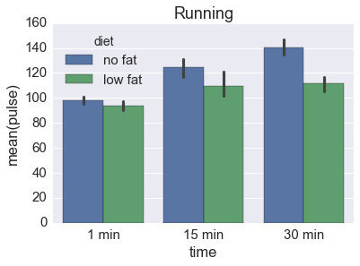
Add title
In [8]:
sns.barplot(x = 'time', y = 'pulse', hue = 'diet', data = df,)
plt.title('Running')
pass
Change coordinate system
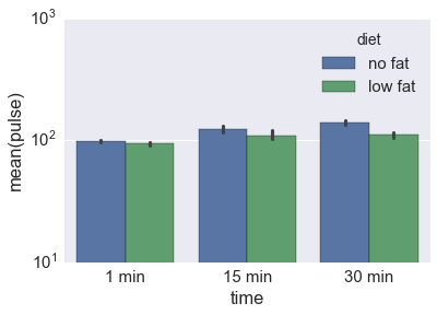
In [9]:
sns.barplot(x = 'time', y = 'pulse', hue = 'diet', data = df)
plt.gca().set(yscale = "log")
pass
Change color palette
In [10]:
sns.barplot(x = 'time', y = 'pulse', hue = 'diet', data = df,
            palette = 'RdBu_r')
pass
Multiple plots
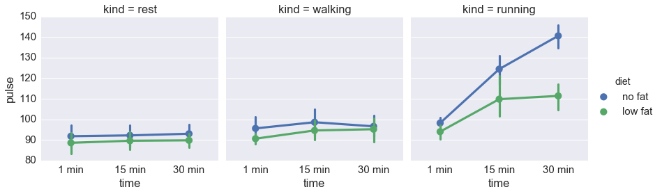
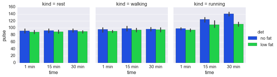
Suppose we want to see the results for all types of exercise, not just running. We can use multiple plots to achieve this.
In [11]:
sns.factorplot(x = 'time', y = 'pulse', hue = 'diet', col = 'kind',
               kind = 'point', data = exercise)
pass
Global changes with themes
In [12]:
sns.set_context("notebook", font_scale=1.0)
sns.barplot(x = 'time', y = 'pulse', hue = 'diet', data = df)
pass
In [13]:
sns.set_context("paper", font_scale=2.0)
sns.set_style('white')
sns.barplot(x = 'time', y = 'pulse', hue = 'diet', data = df)
pass
In [14]:
sns.set()
sns.set_context("notebook", font_scale = 1.5)
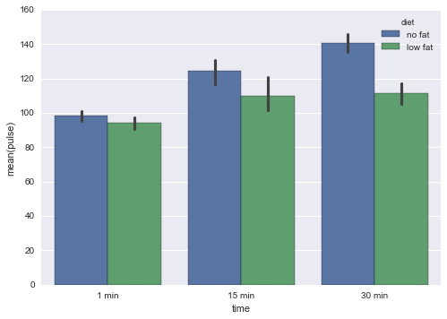
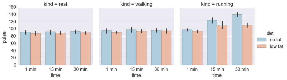
Saving plots
Preferred
In [15]:
g = sns.factorplot(x = 'time', y = 'pulse', hue = 'diet', col = 'kind',
               kind = 'bar', palette = 'bright', data = exercise)
g.savefig('figs/exercise1.png')
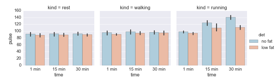
Alternative
In [16]:
sns.factorplot(x = 'time', y = 'pulse', hue = 'diet', col = 'kind',
               kind = 'bar', palette = 'RdBu_r', data = exercise)
plt.savefig('figs/exercise2.png')
Check
In [17]:
from IPython.display import Image
In [18]:
Image('figs/exercise1.png')
Out[18]:

In [19]:
Image('figs/exercise2.png')
Out[19]:
Version Information
In [20]:
%load_ext version_information
%version_information
The version_information extension is already loaded. To reload it, use:
  %reload_ext version_information
Out[20]:
| Software | Version |
|---|---|
| Python | 3.5.2 64bit [GCC 4.2.1 Compatible Apple LLVM 4.2 (clang-425.0.28)] |
| IPython | 5.0.0 |
| OS | Darwin 15.6.0 x86_64 i386 64bit |
| Tue Aug 16 09:04:30 2016 EDT | |
In [ ]: