One of the main exercises in finance is to understand the tradeoff between risk and return. One of the assumptions that we commonly make is that investors are risk averse. That is, to get people to buy equity vs. a Treasury bill, you have to offer a higher return (to compensate them for the risk).
The historical analysis of these asset classes supports the basic idea that there is a positive relation between risk and reward. Consider cumulative wealth indices of these investments. These indices assume that $1 is invested in December 1925 and all proceeds are reinvested (tax free) into the same asset class.

The graph also shows the progress of inflation. Notice the ordering. The cumulative wealth indices exactly mimick our informal intuition about risk. Treasury bills provided the lowest cumulative return and the smallest capitalization equities provided the highest return.
The difference between highest and lowest is rather dramatic. A $1,000 investment in small cap equites would have been worth over $3.4 million by 1995 where as the Treasury bill investment was worth only $12,500. In part, this is a result of compound interest.

There are, of course, some common features. As expected from the cumulative wealth analysis, the smallest monthly return is the Treasury bill and the highest is the smaller capitalization equity portfolio. But this graph contains addition information. The volatility of each asset class's return is also presented (standard deviation of the monthly returns).
Except for the Treasury bill, the volatility is always greater than the average return. For the equity returns, the volatiity if very high. For example, for the S&P 500 equity portfolio, the average return is approximately 1% per month and the volatility is approximately 6%. A one standard deviation band around the mean covers -5% to +7%. If the data were normal, this covers 66% of the possible outcomes. A two standard deviation confidence interval would be -11% to +13% in any month. This shows that equity returns are very volatile.
Often the average returns are presented on an annualized basis. We usually use geometric averaging rather than arithmetic averaging. That is, if the average return is 1% per month, the arithmetic average annual return is 12% (12 times 1%). However, if we receive 1% each month and reinvested it, we would be left with a 12.7% gain at the end of the year. We almost always want our statistics to reflect real investment gains or losses.
The volatility is also expressed as an annual measure. In this case, we do not multiply the monthly volatility by 12. If we were working in terms of variances (volatility or standard deviation is the square root of the variance), we would multiply by 12. For volatility, we multiply by the square root of 12. Hence, for the S&P 500, the average annual volatility is less than 20%.

This graph, which will become a common tool, graphs expected return (Y-axis) against volatility (X-axis). It is sometimes called a mean-standard deviation graph (also mean-variance, or reward to risk). Risk averse investors prefer more return to less and less risk to more. That is, we prefer to be as high as possible and to the left (preferences in northwest direction).
Noice that the long-term corporate bond has higher expected return and lower volatility than the U.S. government bond. It plots above and to the left of the government bond. If we had only two assets to choose among, we would invest in the corporate bond. It dominates an investment in the government bond in terms of mean and standard deviation.
Technically, we refer to this as "unconditional" dominance. It is unconditional because the expected return is proxied by a long historical average. As an investor, we really care about the future returns. The future average return is not necessarily the historical average return. When we refine our analysis and develop forecasting models for returns and variances in the Global Tactical Asset Allocation course, we will examine "conditional" dominance.
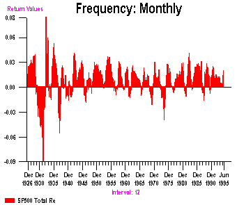
Below the returns to overlapping 12 month holding periods are presented. That is, one investment is from December 1925 to December 1926. The next investment is from January 1926 to January 1927 and so on. Notice that there are many more positive investment returns than negative ones. Nevertheless, there are periods of serious wealth erosion - especially during the Great Depression (notice that the "crash" of 1987 barely shows up on this graph!)

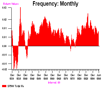
Next, the holding period is increased to five years. While there are still negative episodes, the maximum drawdown (negative return) is much more limited. In the post-1945 sample, there are only a handful of 5 year periods with a negative return (in the mid-1970s).

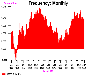
Finally, examine ten year holding periods. There are no instances in the post 1945 period where the average return has been negative. In the last 10 years, the average 10-year returns have been averaging about 13% per year.

The lesson here is that one must often look beyond the monthly statistics to get an appreciation for equity volatility. Over a longer holding period, the bad outcomes are often offset by good outcomes. This exercise shows why equity investment has been popular for the longer term investor.
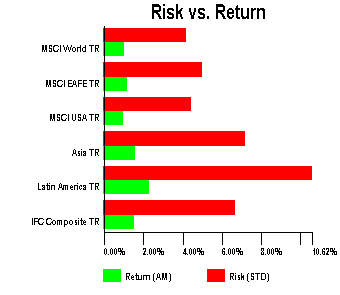
Consider six different portfolios: the Morgan Stanley Capital International (MSCI) world portfolio, the MSCI Europe and Far East (EAFE), the MSCI U.S. (very much like the S&P 500 portfolio), the International Finance Corporation (IFC) Asia emerging markets portfolio, the IFC Latin American portfolio and the IFC emerging market composite portfolio. These data begin in 1970 for the MSCI data and 1985 for the IFC data. For a desciption of the data see Harvey P32 and Bekaert and Harvey P33.

Although it is difficult to see, the U.S. average return performance is the lowest of all the asset classes. The Latin American portfolio produced double the average returns compared to the U.S. This includes the terrible performance that Mexico experienced in December 1994-February 1995 and the fallout in the other emerging markets. However, we must keep in mind that the risk of this investment is different. Indeed, the volatility of this investment is about double the U.S. volatility. [Again, volatility as a risk measure is usually only appropriate when comparing mutually exclusive investment opportunities.]
The mean-standard deviation graph provides additional insights regarding the performance of these asset classes.

In particular, focus on the U.S. and the world portfolio. The world portfolio has higher average return and lower standard deviation. It suggests that a U.S. investor trying decide on a purely domestic or a mixed domestic/international strategy should choose the mixed domestic/international strategy. This strategy dominates the pure U.S. investment. These results are consistent with the analysis presented in Harvey P10. Harvey's results may have been sensitve to the sample (his data ended in May 1989.) The above shows that even after including the period of poor Japanese performance (beginning in 1989), the U.S. portfolio is an unconditionally dominated investment.
Later in the course, we will operationalize these decisions using the same mean-standard deviation framework. There will also be extensions to other alternative evaluative methodologies.

Click here BA350 Index Page
Click here for Campbell
Harvey's Home Page