Using ggplot2: Solutions
In [3]:
suppressPackageStartupMessages(library(tidyverse))
Warning message:
“Installed Rcpp (0.12.12) different from Rcpp used to build dplyr (0.12.11).
Please reinstall dplyr to avoid random crashes or undefined behavior.”Warning message:
“package ‘dplyr’ was built under R version 3.4.1”
In [4]:
head(iris)
| Sepal.Length | Sepal.Width | Petal.Length | Petal.Width | Species |
|---|---|---|---|---|
| 5.1 | 3.5 | 1.4 | 0.2 | setosa |
| 4.9 | 3.0 | 1.4 | 0.2 | setosa |
| 4.7 | 3.2 | 1.3 | 0.2 | setosa |
| 4.6 | 3.1 | 1.5 | 0.2 | setosa |
| 5.0 | 3.6 | 1.4 | 0.2 | setosa |
| 5.4 | 3.9 | 1.7 | 0.4 | setosa |
In [5]:
options(repr.plot.width=4, repr.plot.height=3)
Map data attributes to aesthetics
In [6]:
g <- ggplot(iris, aes(x=Sepal.Length, y=Sepal.Width, color=Species))
g

Use different geometries for the same mapping
In [7]:
g + geom_point()

In [8]:
g + geom_density2d()

In [9]:
g + geom_smooth()
`geom_smooth()` using method = 'loess'

Combine geometries
In [10]:
g + geom_point() + geom_smooth()
`geom_smooth()` using method = 'loess'

Changing labels
In [11]:
g + geom_point() + geom_smooth() +
labs(x="Sepal Length", y="Sepa; Width", title="Iris", subtitle="Plotted with ggplot")
`geom_smooth()` using method = 'loess'

Changing scales
In [12]:
g +
geom_jitter(width = 0.2) +
scale_y_log10()

Group plots using facets
In [13]:
g + geom_point() + geom_smooth() +
facet_wrap(~ Species)
`geom_smooth()` using method = 'loess'

In [14]:
g + geom_point() + geom_smooth() +
facet_wrap(~ Species, ncol = 1)
`geom_smooth()` using method = 'loess'

Turning guides on and off
In [15]:
g + geom_point() + geom_smooth() +
facet_wrap(~ Species) +
guides(color=FALSE)
`geom_smooth()` using method = 'loess'

Reshaping data.frames with gather and plotting
In [16]:
iris %>% gather(measure, value, -Species) %>% head
| Species | measure | value |
|---|---|---|
| setosa | Sepal.Length | 5.1 |
| setosa | Sepal.Length | 4.9 |
| setosa | Sepal.Length | 4.7 |
| setosa | Sepal.Length | 4.6 |
| setosa | Sepal.Length | 5.0 |
| setosa | Sepal.Length | 5.4 |
In [17]:
options(repr.plot.width=6, repr.plot.height=4)
In [18]:
g2 <- ggplot(iris %>% gather(measure, value, -Species),
            aes(x=Species, y=value, fill=Species, color=Species))
In [19]:
g2 + facet_wrap(~ measure) + geom_boxplot()

In [20]:
g2 + facet_wrap(~ measure) + geom_jitter()

In [21]:
g2 + facet_wrap(~ measure) + geom_bar(stat="identity")

Allowing different scales for each plot
In [22]:
g2 + facet_wrap(~ measure, scales="free") + geom_boxplot()

Change coordinates
In [23]:
g2 +
geom_boxplot() +
coord_flip()

In [24]:
options(repr.plot.width=6, repr.plot.height=6)
In [25]:
polar <- g2 +
facet_wrap(~ measure) +
geom_jitter(width = 0.2, size=1) +
coord_polar() +
guides(color=FALSE, fill=FALSE) +
labs(x="", y="")
In [26]:
polar

Transparency
In [27]:
ggplot(iris, aes(x=Sepal.Length, fill=Species)) +
geom_density(alpha=0.5)

Themes
In [28]:
ggplot(iris, aes(x=Sepal.Length, fill=Species)) +
geom_density(alpha=0.5) +
theme_bw()

In [30]:
ggplot(iris, aes(x=Sepal.Length, fill=Species)) +
geom_density(alpha=0.5) +
theme_classic()

In [31]:
ggplot(iris, aes(x=Sepal.Length, fill=Species)) +
geom_density(alpha=0.5) +
theme_dark() +
theme(axis.text.x = element_text(colour = 'red', size=20),
      axis.text.y = element_text(color = 'blue', size=20))

Using color scales
In [32]:
options(repr.plot.width=4, repr.plot.height=3)
Discrete colors or fills
In [33]:
g3 <- ggplot(iris %>% gather(measure, value, -Species),
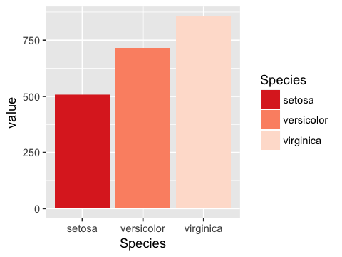
aes(x=Species, y=value, fill=Species)) +
geom_bar(stat="identity")
In [34]:
g3

In [35]:
g3 + scale_fill_brewer(type='seq')

In [36]:
g3 + scale_fill_brewer(type='div')

In [37]:
g3 + scale_fill_brewer(type='qual')

In [38]:
g3 + scale_fill_brewer(type='seq', palette = 'Reds')

In [39]:
g3 + scale_fill_brewer(type='seq', palette = 'Reds', direction = -1)
Continuous colors or fills
In [40]:
suppressPackageStartupMessages(library(genefilter))
In [41]:
n <- 20
m <- 50000
EXPRS <- matrix(rnorm(m * 2 * n), m, 2*n)
rownames(EXPRS) <- paste('g', 1:m, sep='')
colnames(EXPRS) <- paste('pt', 1:(2*n), sep='')
grp <- as.factor(rep(c("Control", "Treated"), each=n))
In [42]:
p.values <- rowttests(EXPRS, grp)$p.value
ii <- order(p.values)
TOPEXPRS <- EXPRS[ii[1:100], ]
In [43]:
M <- data.frame(t(TOPEXPRS)) %>% rownames_to_column("pid") %>% gather(gene, expression, -pid)
In [44]:
head(M)
| pid | gene | expression |
|---|---|---|
| pt1 | g36200 | 0.537766165 |
| pt2 | g36200 | -0.447619190 |
| pt3 | g36200 | 1.262114958 |
| pt4 | g36200 | 0.205835640 |
| pt5 | g36200 | 0.292946391 |
| pt6 | g36200 | -0.007104385 |
In [45]:
options(repr.plot.width=6, repr.plot.height=4)
In [46]:
g4 <- ggplot(M, aes(gene, pid, fill=expression)) +
      geom_tile(colour='white') +
      theme(axis.text.x = element_blank(),
            axis.text.y = element_blank(),
            axis.ticks.x = element_blank(),
            axis.ticks.y = element_blank())
In [47]:
g4

In [48]:
g4 + scale_fill_gradient(low = "white", high="red")

In [49]:
g4 + scale_fill_gradient2(low = "darkgreen", high="darkblue")

Check saved plot

Exercise
Hint: If nothing is plotted, wrap the entire R expression in a
print() statement to see the error message.
In [51]:
head(mtcars)
| mpg | cyl | disp | hp | drat | wt | qsec | vs | am | gear | carb | |
|---|---|---|---|---|---|---|---|---|---|---|---|
| Mazda RX4 | 21.0 | 6 | 160 | 110 | 3.90 | 2.620 | 16.46 | 0 | 1 | 4 | 4 |
| Mazda RX4 Wag | 21.0 | 6 | 160 | 110 | 3.90 | 2.875 | 17.02 | 0 | 1 | 4 | 4 |
| Datsun 710 | 22.8 | 4 | 108 | 93 | 3.85 | 2.320 | 18.61 | 1 | 1 | 4 | 1 |
| Hornet 4 Drive | 21.4 | 6 | 258 | 110 | 3.08 | 3.215 | 19.44 | 1 | 0 | 3 | 1 |
| Hornet Sportabout | 18.7 | 8 | 360 | 175 | 3.15 | 3.440 | 17.02 | 0 | 0 | 3 | 2 |
| Valiant | 18.1 | 6 | 225 | 105 | 2.76 | 3.460 | 20.22 | 1 | 0 | 3 | 1 |
1. Make a scatter plot with y=mpg and x=wt
In [52]:
g <- ggplot(mtcars, aes(wt, mpg)) + geom_point()
In [53]:
g

2 Add a linear regression curve.
In [54]:
g + geom_smooth(method='lm')

3. Add a title ‘Fuel efficiency decreases with weight’, and rename the x and y axis to ‘Weight’ and ‘Miles per gallon’.
In [55]:
g + geom_smooth(method='lm') +
labs(x="Weight", y="Miles per gallon",
     title="Fuel efficiency decreases with weight")

4. Change the color of the scatter points to salmon.
In [56]:
g + geom_point(color='salmon') +
geom_smooth(method='lm') +
labs(x="Weight", y="Miles per gallon",
     title="Fuel efficiency decreases with weight")

4. Change the color of the scatter points to represent the
horsepower hp.
In [57]:
g + geom_point(aes(color=hp)) +
geom_smooth(method='lm') +
labs(x="Weight", y="Miles per gallon",
     title="Fuel efficiency decreases with weight")

5. Use color brewer to set the scale in Q4 with the Oranges
seqeuntial palette for the cyl variable.
In [58]:
g + geom_point(aes(color=as.factor(cyl))) +
geom_smooth(method='lm') +
scale_color_brewer(type='seq', palette = 'Reds') +
labs(x="Weight", y="Miles per gallon",
     title="Fuel efficiency decreases with weight")

7. Make a density plot of mpg and fill by the factor cyl,
and set the transparecny to 0.5.
In [59]:
ggplot(mtcars, aes(mpg, fill=as.factor(cyl))) +
geom_density(alpha=0.5)

8. Repeat Q7, but use 3 separate plots. Remove the legend.
In [60]:
ggplot(mtcars, aes(mpg, fill=as.factor(cyl))) +
facet_wrap(~ cyl) +
geom_density(alpha=0.5) +
guides(fill=FALSE)

9. Create a scatter plot -log(p value) on the y-axis and SNP
location on the x-axis, coloring by chromosome number. This is known as
a Manhattan plot. Use the code below to simulate data for the plot. Use
the Set3 palette of qual type in scale_color_brewer for the
color scheme.
n <- 10000 # number of genes
position <- 1:n
chromosome <- factor(rep(1:10, each=n/10))
p.value <- runif(n)
df <- data.frame(position=position, chromosome=chromosome, p.value=p.value)
In [61]:
n <- 10000 # number of genes
position <- 1:n
chromosome <- factor(rep(1:10, each=n/10))
p.value <- runif(n)
df <- data.frame(position=position, chromosome=chromosome, p.value=p.value)
In [62]:
ggplot(df %>% mutate(log.p.value = -log(p.value)),
       aes(x=position, y=log.p.value, color=chromosome)) +
geom_point(size=0.5) +
scale_color_brewer(type='qual', palette='Set3')

In [ ]: