Matplotlib - bar,scatter and histogram plots
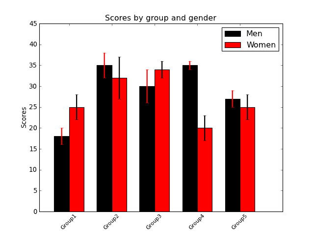
Simple bar plot
import numpy as np
import matplotlib.pyplot as plt

fig = plt.figure()
ax = fig.add_subplot(111)

## the data
N = 5
menMeans = [18, 35, 30, 35, 27]
menStd =   [2, 3, 4, 1, 2]
womenMeans = [25, 32, 34, 20, 25]
womenStd =   [3, 5, 2, 3, 3]

## necessary variables
ind = np.arange(N)                # the x locations for the groups
width = 0.35                      # the width of the bars

## the bars
rects1 = ax.bar(ind, menMeans, width,
                color='black',
                yerr=menStd,
                error_kw=dict(elinewidth=2,ecolor='red'))

rects2 = ax.bar(ind+width, womenMeans, width,
                    color='red',
                    yerr=womenStd,
                    error_kw=dict(elinewidth=2,ecolor='black'))

# axes and labels
ax.set_xlim(-width,len(ind)+width)
ax.set_ylim(0,45)
ax.set_ylabel('Scores')
ax.set_title('Scores by group and gender')
xTickMarks = ['Group'+str(i) for i in range(1,6)]
ax.set_xticks(ind+width)
xtickNames = ax.set_xticklabels(xTickMarks)
plt.setp(xtickNames, rotation=45, fontsize=10)

## add a legend
ax.legend( (rects1[0], rects2[0]), ('Men', 'Women') )

plt.show()
(Source code, png, hires.png, pdf)
Another bar plot
from mpl_toolkits.mplot3d import Axes3D
import matplotlib.pyplot as plt
import numpy as np

fig = plt.figure()
ax = fig.add_subplot(111,projection='3d')
for c, z in zip(['r', 'g', 'b', 'y'], [30, 20, 10, 0]):
    xs = np.arange(20)
    ys = np.random.rand(20)

    # You can provide either a single color or an array. To demonstrate this,
    # the first bar of each set will be colored cyan.
    cs = [c] * len(xs)
    cs[0] = 'c'
    ax.bar(xs, ys, zs=z, zdir='y', color=cs, alpha=0.8)

ax.set_xlabel('X')
ax.set_ylabel('Y')
ax.set_zlabel('Z')

plt.show()
(Source code, png, hires.png, pdf)

Scatter plot
#!/usr/bin/env python
import matplotlib.pyplot as plt
import numpy as np

fig = plt.figure()
ax1 = fig.add_subplot(121)

## the data
N=1000
x = np.random.randn(N)
y = np.random.randn(N)

## left panel
ax1.scatter(x,y,color='blue',s=5,edgecolor='none')
ax1.set_aspect(1./ax1.get_data_ratio()) # make axes square


## right panel
ax2 = fig.add_subplot(122)
props = dict(alpha=0.5, edgecolors='none' )

handles = []
colors = ['blue', 'green', 'magenta', 'cyan']
for color in colors:
    x = np.random.randn(N)
    y = np.random.randn(N)
    s = np.random.randint(50,200)
    handles.append(ax2.scatter(x, y, c=color, s=s, **props))

ax2.set_ylim([-5,11])
ax2.set_xlim([-5,11])

ax2.legend(handles, colors)
ax2.grid(True)
ax2.set_aspect(1./ax2.get_data_ratio())
plt.show()
(Source code, png, hires.png, pdf)

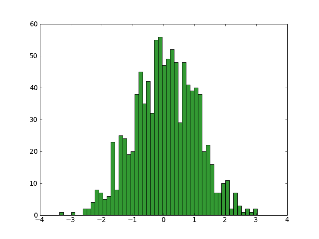
Histogram plot
Here is the matplotlib histogram demo
import numpy as np
import matplotlib.pyplot as plt


fig = plt.figure()
ax = fig.add_subplot(111)

x = np.random.normal(0,1,1000)
numBins = 50
ax.hist(x,numBins,color='green',alpha=0.8)
plt.show()
(Source code, png, hires.png, pdf)