Matplotlib - line and box plots
Simple line plot
import numpy as np
import matplotlib.pyplot as plt

## initialize the axes
fig = plt.figure()
ax = fig.add_subplot(111)

## format axes
ax.set_ylabel('volts')
ax.set_title('a sine wave')

t = np.arange(0.0, 1.0, 0.01)
s = np.sin(2*np.pi*t)
line, = ax.plot(t, s, color='blue', lw=2)
(Source code, png, hires.png, pdf)

Lines with markers
import numpy as np
import matplotlib.pyplot as plt

## initialize the figure
fig = plt.figure()


## the data
t = np.arange(0.0, 1.0, 0.01)
s = np.sin(2*np.pi*t)

## the top axes
ax1 = fig.add_subplot(3,1,1)
ax1.set_ylabel('volts')
ax1.set_title('a sine wave')

line1 = ax1.plot(t, s+5.0, color='blue', lw=2)
line2 = ax1.plot(t, s+2.5, color='red', lw=2)
line3 = ax1.plot(t, s, color='orange', lw=2)

## the middle axes
ax2 = fig.add_subplot(3,1,2)
ax2.set_ylabel('volts')
ax2.set_title('a sine wave')

line1 = ax2.plot(t, s+5.0, color='black', lw=2,linestyle="--")
line2 = ax2.plot(t, s+2.5, color='black', lw=2,linestyle="-.")
line3 = ax2.plot(t, s, color='#000000', lw=2,linestyle=":")

## the thrid axes
ax3 = fig.add_subplot(3,1,3)
ax3.set_ylabel('volts')
ax3.set_title('a sine wave')

line1 = ax3.plot(t,s+5.0, color='blue', marker="+")
line2 = ax3.plot(t,s+2.5, color='red', marker="o")
line3 = ax3.plot(t,s, color='orange', marker="^")

## adjust the space between plots
plt.subplots_adjust(wspace=0.2,hspace=.4)
(Source code, png, hires.png, pdf)

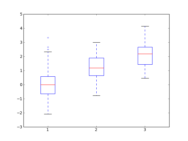
Box plots
For more information on box plots try the demo
import numpy as np
import matplotlib.pyplot as plt


fig = plt.figure()
ax = fig.add_subplot(111)

x1 = np.random.normal(0,1,50)
x2 = np.random.normal(1,1,50)
x3 = np.random.normal(2,1,50)

ax.boxplot([x1,x2,x3])
plt.show()
(Source code, png, hires.png, pdf)