A.1 Data Display
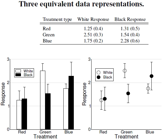
Figure A.1: A table, a bar graph, and a plot are three different, but equivalent, ways to show the same data. No one way is best in all cases, and each is best in some cases. The table displays just a few made-up numbers, along with their uncertainties in parentheses. Though “treatment” and “response” imply active experimentation, one would treat observational categories and correlated features similarly.
Scientists present data in many different ways, dependent on their desired emphasis, economy of journal space, and personal tastes. Here are three different presentations of one set of made-up data.
Tables of data hold information, a greatly useful feature allowing other people to process the numbers, but one’s focus gets drawn towards individual numbers, not general patterns. I provide one such example in Figure 3.15.
The bar graph with the uncertainty scale sitting on top, sometimes derisively called “pinhead plots”, emphasizes levels of effect across different treatments. I discuss uncertainties later on in Figure A.6; here let’s just think of them as uncertainties in the listed values. Some scientific disciplines use bar graphs extensively, and I use them in part to keep with the original publication’s spirit, and in part because bar graphs provide good visual comparisons when treating categorical variables. Sometimes experiments consist entirely of two treatment categories, or experimental scenarios, like the status of vegetation, barren versus green, or a few treatment levels, low, medium, and high. Bar graphs simplify comparing several measurements at these values by a quick look at differing patterns (Figure 5.9 provides three good examples).
The graph with data points repeats the information in the bar graph. In this case of very few points, a bar graph and data plot provide equivalent representations. However, situations where the horizontally plotted variable, identified here as the treatment, takes on many values and the response variable on the vertical axis changes in a broad scale manner over these values, one wants to see how the line changes. Often there are so many data points that they make up a continuous sweep, and a scientist plots a line, not individual points.[1] One might draw a line between the data points, but in the situation of a categorical variable, a line wouldn’t make sense. No continuous connection exists between the different categories, presumably, and the guide to the eye that the line provides has no value as an interpolating device. With a continuous variable on the X-axis, however, a line joining the data points provides assistance envisioning the full connection between the two axes’ variables. For example, replace red, green, and blue with the temperatures 60F, 65F, and 70F, then extend the experiment from 40F to 100F by 1F increments, and add a few shades of grey responses. Tables of numbers become data archives, and only plots, not charts, are readable.
——————————-
[1]Some people call the horizontal axis the abscissa, and the vertical axis the ordinate, or at least, by definition, the distances of points along each axis. I don’t use these terms, and rarely hear other scientists use them. I must admit I’ve always found the two terms confusing, just like the terms stalagmites and stalactites. I really prefer calling the axes by X and Y, harking back to my training in the physical sciences. The most common custom, however, places the “independent” variable on the horizontal axis, and the “dependent” variable on the vertical axis.
