A.5 Quantities Covary
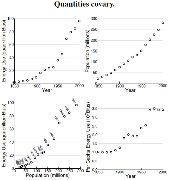
Figure A.5: In the top two graphs, I plot U.S. energy use and population since 1850. Plotting the two dependent quantities against one another shows that they increase together with time, and plotting the per capita energy use shows a rather marked increase over the last century and a half.
Beyond any doubt, time is the ultimate independent variable. Here I plot two quantities changing with time, the human population and total energy use of the United States from 1850 to 2000. I discuss human population in detail in Figure 1.1, and U.S. energy use in Figure 3.1, and don’t dwell on them here. Both of the top graphs mesh well with the idealized dependent variable on the Y-axis and independent variable on the X-axis, but those graphs provide limited information.
Here I want to make two points, one scientific, the other a minor pedagogical one. At bottom left I eliminated the independent variable, time, and plotted the two dependent variables, energy use and population, against one another. Pedagogically, scientists don’t always know whether the variable plotted on the horizontal axis really has the status of an independent variable, nor whether the one on the vertical axis really qualifies as a dependent one. Sometimes, like I’ve done here, people plot co-dependent variables against each other because that’s all they have to plot. Indeed, Figure A.3 shows an imaginary situation where one variable predicts just 8% of the variation in the other variable. Take that small bit away and there’s no correlation whatsoever between the variables, meaning we have two essentially independent variables. In other words, fixating too intently on the idea of an independent X-axis variable doesn’t carry you very far.
That said, my more concrete point is that people use energy, thus I chose population as the new “independent” variable on the X-axis that drives energy use. My curiosity about per capita energy use through time causes me to divide total energy use by population, revealing that Americans doubled their energy use between 1850 and 1950, and nearly doubled it again since 1950.
Graphs allow you to manipulate and explore data in ways that just aren’t possible by staring at a table of numbers. Graphs allow you to pose questions and answer them with the available data, or contemplate the additional data needed to address new questions. In other words, think like a scientist.

The per capita energy use should read 10^8 Btus/person, not 10^7.