A.4 Transformed
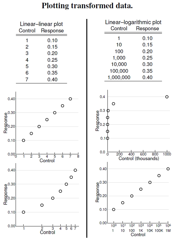
Figure A.4: Tables of data appropriate to linear and logarithmic plotting axes on the left and right, respectively.
The idea of a logarithmic axis confuses many students reading graphs. In some cases, like the one I made up in the left-hand side table, the X and Y variables relate to one another in a linearly dependent manner: Increasing the control from 1 to 2 increases the response by 0.05; increasing the control from 6 to 7 also increases the response by 0.05. We see this directly proportionate response by the straight-line, constant slope in the upper left graph. Not surprisingly, we say that the response has a linear dependence on the control parameter. Any other type of response would be called not linear, or “nonlinear.” Most variables depend on their underlying factors through mechanistic processes that lead to nonlinear responses.
Normal, untransformed plots rely on the connection between X and Y embodied in the equation for a straight line, Y = mX +b, where m is the slope, and b is the Y -intercept, the value of Y when X = 0. The slope tells how much Y changes when X is changed by one unit of value, like the 0.05 described above.
Other situations exist, for example, Y = cXd, Y = cdX, and X = cYd. In these situations one takes the logarithm of both sides of the equation, yielding log Y = log c + d logX, log Y = log c + X log d, and logX = log c + d log Y , respectively. Thus, depending on the relationship between the variables, the best axes transformations follow.
I depict one special nonlinear situation in the table on the right-hand side. Here, compared to the linear example, the Y variable depends more weakly on the X-variable, and the response saturates as the X-variable increases. In this imaginary case, increasing the control parameter by one order of magnitude, from 1 to 10 (an increase of 9), increases the response by 0.05, while increasing the control from 100,000 to 1,000,000 (an increase of 900,000) also increases the response by 0.05. The effect on the response variable of a certain increase in control depends on the control value itself. That differential response wonderfully describes a nonlinear response.
When one variable spans several orders of magnitude while the other doesn’t, one plots the graph using a linear axis for the constrained value and a logarithmic axis for the widely varying one. I first show, in the upper right graph, what happens if you don’t choose the correct plotting option, instead using two linear axes. All the X-values bunch up near the origin, making the dependence extremely difficult to see. These bunched up values need to be stretched out, and the lower right plot achieves exactly that goal. In fact, looking at the tick labels along the bottom, we see that the exponents, for example the “4” on 104, written above the 10K (meaning 10,000), have a linear progression on the logarithmic axis. This is exactly as it should be: We can write any number as “X=10Z”, in which case, logX = Z log 10 = Z. The logarithmic axis plots the exponent linearly.
