A.2 Visual Correlations
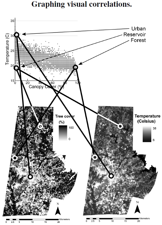
Figure A.2: These two maps show Durham County’s 2005 canopy cover, bottom left, and thermal image, bottom right. My eyes show strong visual correlations between the two images, but scientific analysis requires numbers. My lines connect representative points in the images to appropriate data points in the graph.
In this figure I describe the connection between visually observed data and plotted data, and explain why scientists pursue both approaches. The graph at top plots temperature and tree canopy cover values from the images, showing that low tree cover corresponds to high temperatures, and high canopy cover to low temperatures. I point out three specific examples in the images. The urban point shows light areas in both tree cover and temperature, meaning high temperature where no trees sit. An unusual point, low temperature with low tree cover, identifies a drinking water reservoir in northern Durham County, with a light area in tree cover and dark area in temperature. Forested areas have dark areas for both tree cover and temperature, meaning a cool, tree covered location.
Let’s not worry here about the mechanisms — thermal mass, urban heat island, and all that—that join the two variables displayed in the images of Durham County’s canopy cover and thermal profile. I extensively discuss the science behind these images and graph in Figures 2.1 and 2.3, and I use them here just to explain several things about graphing.
For my purposes here, just note that the two variables, for whatever reason, covary across Durham County, and the basis for our sense of covariation arises from visual inspection and pattern matching. Of course, I hope everyone sees what I see: Light areas in the left image coincide with light areas in the right image. If someone doesn’t see this correspondence, it just emphasizes that science doesn’t get very far by visual inspection alone because visual inspection varies from person to person in a nonquantifiable way. Indeed, color-blind scientists may have a particularly tough time with arbitrarily chosen color palettes. We need to quantify the patterns and apply some statistical analyses to answer a specific question like the extent to which variation in one variable explains the variation in another, answered by a parameter like R2 discussed in Figure A.3.
However, the upper plot is incomplete. The images reveal one feature not shown in the upper plot. Notice how pixels with low tree cover (white) and high temperature (white) clump together in the county’s central area, where the City of Durham sits. This clumpiness defines a spatial correlation. Imagine taking all the cover–temperature pixel pairs and shuffling them all throughout the county, making sure pixel pairs are shuffled to the same location. The county images would take on an even, randomized grey tone, but the graph at top wouldn’t change at all. Unshuffled, the images clearly show more information than the top plot.
