 Linear regression models
Notes on linear
regression analysis (pdf file)
Introduction
to linear regression analysis
Mathematics
of simple regression
Regression examples
·
Beer sales vs.
price, part 1: descriptive analysis
·
Beer sales vs. price, part 2: fitting a simple
model
·
Beer sales vs. price, part 3: transformations
of variables
·
Beer sales vs.
price, part 4: additional predictors
·
NC natural gas
consumption vs. temperature
·
More regression datasets
at regressit.com
What to look for in
regression output
What’s a good
value for R-squared?
What's the bottom line? How to compare models
Testing the assumptions of
linear regression
Additional notes on regression analysis
Stepwise and all-possible-regressions
Excel file with
simple regression formulas
Excel file with regression
formulas in matrix form
Notes on logistic regression (new!)
Regression example, part 1: descriptive analysis
Any
regression analysis (or any sort of statistical analysis, for that matter) ought
to begin with a careful look at the raw material: the data. Where did it come from, how was it
measured, how many observations are available, what are the units, what are
typical magnitudes and ranges of the values, and perhaps most importantly, what do the variables look like? Much of your brain is devoted to the
processing of visual information, and failure to engage that part of your brain
from the very beginning is a good start to a bad analysis.
The data file for this example
consists of 52 weeks of average-price and total-sales data for a small chain of
supermarkets whose pricing policies are centrally controlled. (This is real data, apart from some very
minor adjustments for the 30-packs.)
One of the first things to consider in assembling a data set for
regression analysis is the choice of units
(i.e., scaling) for the variables.
At the end of the day you will be looking at error measures that are
expressed in the units of the dependent variable, and the model coefficients
will be measured in units of predicted change in the dependent variable per
unit of change in the independent variable. Ideally these numbers should scaled in a way that makes them easy to read and easy to
interpret and compare. In this analysis, the price and sales
variables have already been converted to a per-case (i.e., per-24-can) basis,
so that relative sales volumes for different carton sizes are directly comparable
and so that regression coefficients are directly comparable for models fitted
to data for different carton sizes.
The first few rows of the data set (in an Excel file) look like this:
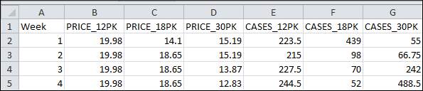
The column
headings were chosen to be suitable as descriptive variable names for the
analysis. The value of 19.98
for PRICE_12PK in week 1 means that 24 cans of beer cost $19.98 when purchased
in 12 packs that week (i.e., the price of a single 12-pack was $9.99), and the
value of 223.5 for CASES_12PK means that 447 12-packs were sold (because a case
is two 12-packs).
Let’s
begin with a look at the descriptive statistics, which show typical magnitudes
and the ranges of the variables:
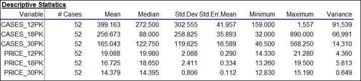
Here it is seen that sales volume (measured in comparable units of cases)
was greater for the smaller carton sizes
(399 cases’ worth of 12-packs vs. 165 for 30-packs, with 18-packs
in the middle), while the average price-per-case was significantly smaller for
the larger carton sizes ($14.38 per case on average for 30-packs, vs. $19.09
per case for 12-packs, with 18-packs again in the middle). However, there was considerable
variation in prices of each carton size, as shown by the minimum and maximum
values.
Because these are time series variables, it is vitally important to look
at their time series plots, as shown
below. (Actually, you should look
at plots of your variables versus row number even if they are not time series You never know what you might see. For non-time series data, you would not
want to draw connecting lines between the dots, however.) What stands out clearly in these plots
is that (as beer buyers will attest) the prices of different carton sizes are
systematically manipulated from week to week over a wide range, and there are
spikes in sales in weeks where there are price cuts. For example, there was deep cut in the
price of 18-packs in weeks 13 and 14, and a corresponding large increase in
sales in those two weeks. In fact,
if you look at all the cases-sold plots, you can see that sales volume for
every carton size is rather low unless
its price is cut in a given week.
(High-volume beer drinkers are very price-sensitive.) Another thing that stands out is the pattern of price manipulation was not
the same for all the carton sizes:
prices of 12-packs were not manipulated very often, whereas prices of
30-packs were manipulated on an almost week-to-week basis in the first half of
the year, and prices of 18-packs were more frequently manipulated in the second
half of the year. So, at this point
we have a pretty good idea of what the qualitative patterns are in weekly
prices and sales.

If our goal is to measure the price-demand relationships by fitting
regression models, we are also very interested in the correlations among the
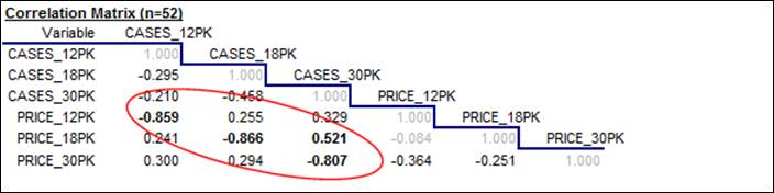
variables and in the appearance of their scatterplots. Here is the correlation matrix, i.e., the table of all pairwise correlations
among the variables. (Remember that
the correlation between two variables is a statistic that measures the relative
strength of the linear relationship between them, on a scale of -1 to +1.) What stands out clearly here is that (as
we already knew from looking at the time series plots) there are very strong, negative correlations between price and sales
for all three carton sizes (greater than 0.8 in magnitude, as it turns out),
which are measures of “the price elasticity of demand.” There are also some weaker positive
correlations between the price of one carton size and sales of another--for
example, a correlation of 0.521 between price of 18-packs and sales of
30-packs. These are measures of
“cross-price elasticities”, i.e., substitution effects. Consumers tend to buy fewer 30-packs
when the price of 18-packs is reduced, presumably because they buy 18-packs
instead.
Last but not least, we should look at the scatterplot matrix of the variables, i.e., the matrix of all 2-way
scatterplots. The scatterplot
matrix is the visual counterpart of the correlation matrix, and it should
always be studied as a prelude to regression analysis if there are many
variables. (Virtually all
commercial regression software offers this feature, although the results vary a
lot in terms of graphical quality.
The ones produced by RegressIt, which are shown here, optionally include
the regression line, center-of-mass point, correlation, and squared
correlation, and each separate chart can be edited.) The full scatterplot matrix for
these variables is a 6x6 array, but we are especially interested in the 3x3
submatrix of scatterplots in which sales volume is plotted vs. price for
different combinations of carton sizes:
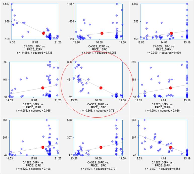
Each of these plots shows not only the price-demand relationship for sales
of one carton size vs. price of another, but it also gives a preview of the
results that will be obtained if a simple regression model is fitted. On the pages that follow,
regression models will be fitted to the sales data for 18-packs. From the scatterplot in the center of
the matrix, we already know a lot about the results we will get if we regress
sales of 18-packs on price of 18-packs.
Some “red flags” are already waving at this point, though. The price-demand relationships are quite
strong, but the variance of sales is not consistent over the full range of
prices in any of these plots.
Go on to next step: interpreting simple regression output
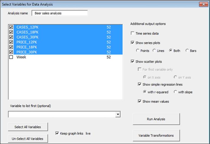
By the way, all of the output shown above was generated at one time on a
single Excel worksheet with a few keystrokes using the Data Analysis procedure
in RegressIt, as shown below.
Hopefully your software will make this relatively easy too.