Notes on linear
regression analysis (pdf file)
Introduction
to linear regression analysis
Mathematics
of simple regression
Regression examples
·
Beer sales vs. price, part 1: descriptive
analysis
·
Beer sales vs.
price, part 2: fitting a simple model
·
Beer sales vs. price, part 3: transformations
of variables
·
Beer sales vs.
price, part 4: additional predictors
·
NC natural gas
consumption vs. temperature
·
More regression datasets
at regressit.com
What to look for in
regression output
What’s a good
value for R-squared?
What's the bottom line? How to compare models
Testing the assumptions of linear regression
Additional notes on regression
analysis
Stepwise and all-possible-regressions
Excel file with
simple regression formulas
Excel file with regression
formulas in matrix form
Notes on logistic regression (new!)
If you use
Excel in your work or in your teaching to any extent, you should check out the latest
release of RegressIt, a free Excel add-in for linear and logistic regression.
See it at regressit.com. The linear regression version runs on both PC's and Macs and
has a richer and easier-to-use interface and much better designed output than
other add-ins for statistical analysis. It may make a good complement if not a
substitute for whatever regression software you are currently using,
Excel-based or otherwise. RegressIt is an excellent tool for interactive
presentations, online teaching of regression, and development of videos of
examples of regression modeling. It includes extensive built-in
documentation and pop-up teaching notes as well as some novel features to
support systematic grading and auditing of student work on a large scale. There
is a separate logistic
regression version with
highly interactive tables and charts that runs on PC's. RegressIt also now
includes a two-way
interface with R that allows
you to run linear and logistic regression models in R without writing any code
whatsoever.
If you have
been using Excel's own Data Analysis add-in for regression (Analysis Toolpak),
this is the time to stop. It has not
changed since it was first introduced in 1993, and it was a poor design even
then. It's a toy (a clumsy one at that), not a tool for serious work. Visit
this page for a discussion: What's wrong with Excel's Analysis Toolpak for regression
Regression
example, part 2: fitting a simple
model
Having already performed some descriptive data
analysis in which we learned quite a bit about relationships and time
patterns among the beer price and beer sales variables, let’s naively
proceed to fit a simple regression model
to predict sales of 18-packs from price of 18-packs. I say “naively” because,
although we know that there is a very strong relationship between price and
demand, the scatterplot indicated that there is a problem with one of the
assumptions of a regression model, namely that vertical deviations from the
regression line (prediction errors) ought to have roughly the same variance for
small and large predictions. Also,
there are some logical problems with a model that assumes the relation between
sales and price to be perfectly linear in situations where the smallest values
of sales are tiny in comparison to the largest ones. Putting those concerns aside for the
moment, here is the standard regression summary output (as formatted by
RegressIt) for a model in which SALES_18PK is the dependent variable and
PRICE_18PK is the independent variable:
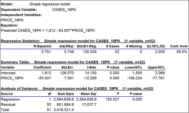
The numbers are interpreted as follows:
a. The
estimated regression equation is printed out at the top: Predicted
CASES_18PK = 1,812 - 93.007*PRICE_18PK. It shows how the coefficients that
appear in the regression summary table below are to be used in predicting sales
from price. This is the equation of
a straight line whose intercept is
1812 (the height of the line at the point where PRICE_18PK is equal to zero,
which it will never come close to in practice) and which has a slope of -93.007, which means the model
predicts that 93 fewer cases worth of
18-packs will be sold per $1 increase
in the price per case.
The intercept in a regression model is rarely a number with any direct economic
or physical meaning. The important
thing to keep in mind about a regression model is that the regression line always passes through the center of mass of the
data, i.e., the point in coordinate space at which all variables are equal
to their mean values. The slope
coefficient(s) tell you how the expected value of the dependent variable will
move away from its mean value as the independent variables move away from their
own mean values. From the
desciptive statistics table, we know that the center of mass of the data for
this regression is the point at which price-per-case for 18-packs is $16.73 and
the number of cases sold is 257.
Just knowing these two numbers tells us that we should predict 257 cases
sold when the price-per-case is $16.73, regardless of the results of fitting
the regression model.
b. The most important number in the output, besides the model coefficients,
is the standard error of the regression, which is 131 in this example. (To 3 decimal places it is 130.529, but
it should be rounded off to an integer value for presentation. Don’t confuse your audience with
more decimal places than are significant.
Many statistical programs routinely display 10 or more digits of
precision in their output tables!)
The standard error of the
regression is the estimated standard deviation of the “noise” in
the dependent variable that is unexplainable by the independent variable(s),
and it is a lower bound on the standard deviation of any of the model’s
forecast errors, under the assumption that the model is correct. The estimated standard deviation of a
forecast error is actually slightly larger
than the standard error of the regression because it must also take into
account the errors in estimating the parameters of the model, but there is not
much difference if the sample size is reasonably large and the values of the
independent variables are not too extreme.
(For details of how the exact standard errors of forecasts are computed,
see the "Mathematics of simple
regression" page or “Notes on linear
regression” handout.)
From the usual 2-standard-error rule of thumb, it follows that a 95% confidence interval for a forecast
from the model is approximately equal
to the point forecast plus or minus 2 times the standard error of the regression. The
exact number of standard errors to use in this calculation is the
“critical t-value” for a two-tailed 95% confidence interval with 50
degrees of freedom, which is 2.009 as shown at the right end of the regression
statistics table. (The number of
“degrees of freedom” for the t-statistic is the number of data
points minus the number of coefficients estimated, which is 52 minus 2 in this
case.)
So, in this model, the value of 131 for the standard error of the regression
means (roughly) that a 95% confidence interval for any forecast will be equal
to the point forecast plus-or-minus 262 cases. We begin to detect a problem here: the number of cases sold is typically
much less than 100 in weeks when the price level is high. If the model is capable of giving an
accurate point forecast in such a week, then it would be silly to compute a
lower confidence limit for the forecast by subtracting 262 from it!
c. Because this is a simple regression
model, R-squared is merely the square of the correlation between price and
sales: 0.751 = (-0.866)2. This is the fraction of the
variance of the dependent variable that is “explained” by the
independent variable, i.e., the fractional amount by which the variance of the
errors is less than the variance of the dependent variable. Adjusted
R-squared is an unbiased estimate
of the fraction of variable explained, taking into account the sample size and
number of variables in the model, and it is always slightly smaller than
unadjusted R-squared, although the difference is unimportant in this case: both numbers round off to 75%. Adjusted
R-squared has a tight connection with the standard error of the
regression: one goes up as the
other goes down, for models fitted to the same sample of the same dependent
variable.
d. The
estimated intercept is 1812 (cases) with a standard error of 128. The
standard error of a coefficient is the estimated
standard deviation of the error in estimating it. By the usual rule of thumb, an approximate 95% confidence interval for
a coefficient is the point estimate plus or minus two standard errors, which is
1812 +/- 2(128) = [1556,2068] for the intercept. The exact
95% confidence interval is [1555,2069] as shown in the regression summary
table. The difference is trivial,
and in any case the confidence limits only have meaning if the model
assumptions are approximately correct.
e. The cofficient of PRICE_18PK is -93 with
a standard error of 7.6, and its 95% confidence interval is [-108,-78]. This is not too wide an interval
(as these things go), so it appears that we have a reasonably precise estimate
of the strength of the price-demand relationship. Again, though, these numbers are
meaningful only if the model assumptions are approximately correct, in
particular the assumption that the same price-demand relationship holds across
the whole range of prices.
f. The t-statistic of a coefficient
estimate is its point value divided by its standard error, i.e., its
“number of standard errors away from zero.” In general we do not care about the t-stat
of the intercept unless it is
possible for all the independent variables to simultaneously go to zero and we
are interested in whether the prediction should also be zero in such a
situation. (That is not the case
here.) The t-stat of the slope
coefficient is -93.007/7.581 = -12.269. By the usual rule of thumb, a coefficient estimate is significantly
different from zero (at the 0.05 level of significance) if its t-stat is
greater than 2 in magnitude, which is certainly true here. (Again, the exact critical t-value
is 2.009, not 2, for this model, but the difference is not important.)
The t-statistic of a coefficient estimate exceeds the specified critical value
if and only if the corresponding confidence interval for the coefficient does
not include zero: this is a
mathematical identity. So, it is
equivalent to check to see whether the magnitude of the t-statistic exceeds the
critical value for the given level of confidence or to check to see whether the
correponding confidence interval includes zero.
g. In
the analysis-of-variance table, the
only interesting numbers are the
F-statistic and its P-value.
The F-statistic tests whether all the independent variables in the model
are “jointly” significant, regardless of whether they are
individually significant. In a
simple regression model, there is only one independent variable, so the the
F-statistic tests its significance alone.
In fact, in a simple regression
model, the F-statistic is simply the square of the t-statistic of the slope
coefficient, and their P-values are the same. In this case we have 150.527 = (-12.269)2. The F-statistic is usually not of
interest unless you have a group of variables that should logically be taken together
as a unit (say, dummy variables for a set of mutually exclusive conditions, as
you might have in a designed experiment), and therefore the
analysis-of-variance table is minimized (hidden) by default in RegressIt.
Now, for a better perspective on how well the model fits the data,
let’s look at the graphical output.
First, here is the line fit plot, which shows the regression line
superimposed on the data. This is
exactly the same line that was superimposed on the scatterplot in the
descriptive data analysis, except that it also shows 95% confidence bands for
forecasts.
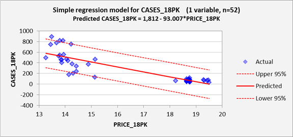
Here we see a couple of problems.
First, as already noted, the
unexplained deviations from the regression line are much larger for low price
levels than for high price levels. Under the assumptions of the regression
model, they should be approximately the same size across the whole range, as
indicated by the fact that the 95% confidence bands have an almost constant
width over the whole range. In
theory, at every price level, roughly 95% of the data should fall within the
95% confidence bands, and the vertical
deviations from the regression line should be identically normally distributed.
Also note that there is a hole in the middle of the price range: no values in
between the low $15’s and the low $18’s were observed. This is not necessarily a problem as far
as the regression model is concerned:
there is no requirement that values of the independent variable(s) should have any particular sort of
distribution. They might even take on only integer values, perhaps just
0’s and 1’s.
What’s important is how the values of the dependent variable are distributed, for any given values of the
independent variable(s).
An even more serious logical problem is also observed in this plot: the
model predicts negative values of sales for prices larger than $19.50 per case
(just barely outside the historical range), and the lower 95% confidence limit
for a prediction is negative for prices larger than about $16.50 per case. So, the predictions and confidence
intervals for high price levels cannot be taken very seriously! One alternative modeling strategy that
suggests itself is that the sales data for 18-packs could be broken up into two
subsets, one for low prices and one for high prices, in light of the fact that
intermediate price levels are typically not used. However, let us suppose that we are
interested in predicting what might happen
if we were to set the price to some arbitrary value in the middle range, for
which it is necessary to fit one model to all the data.
Next let’s look at a time
series plot of actual and predicted values, to see how how the forecasts
and data lined up on a week-to-week basis.
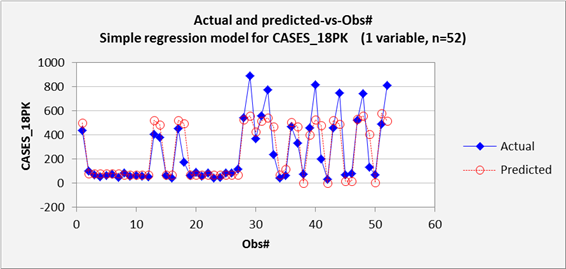
Here we see that the model slightly overpredicted the moderate sales
spikes that occurred early in the year and significantly underpredicted the
large spikes that occurred later in the year. This plot should always be expected to
show some regression-to-the-mean on average, but clearly the model is making
errors for large predictions in a very systematic way. In general, this plot is most useful for
detecting significant time patterns
in the deviations between forecasts and actual values. Here the problem is not a time pattern
in the errors per se.
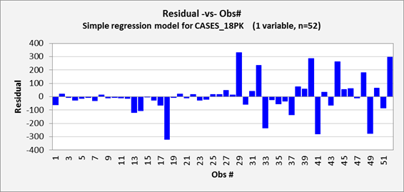
The remainder of the chart output for this model is shown below. The residual-vs-observation-number
chart (i.e., residuals versus
time, which is always important for time series data) shows some detail that
wasn’t quite as apparent on the previous chart, namely that the model
made a few serious overpredictions
(errors that are negative in sign) along with the serious
underpredictions. This
plot is also somewhat unsatisfactory for the fact that it shows that nearly all
of the model’s largest errors occurred in the second half of the
year. The reason for this is clear: most of the price manipulation and most
of the spikes in sales occurred in the second half of the year. Still, the model assumes that the errors
should have the same variance at all points in time, regardless of the values
of the independent variables.
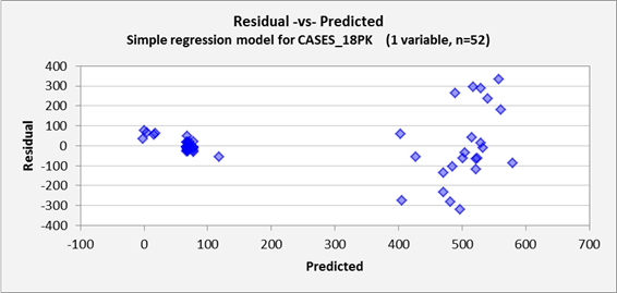
The residual-vs-predicted plot
is where you go to look for evidence of nonlinearities
(which would show up here as a curved
pattern) or heteroscedasticity (errors
that do not have the same variance for all levels of the predictions). Here we see very strong
heteroscedasticity, which was also apparent on the line fit plot: the model makes bigger errors when
making bigger predictions. For a simple regression model, the
residual-vs-predicted plot is just a “tilted” copy of the line fit
plot in which the regression line is superimposed on the X-axis, and it is also
flipped left-to-right if the slope coefficient is negative, as it is here.
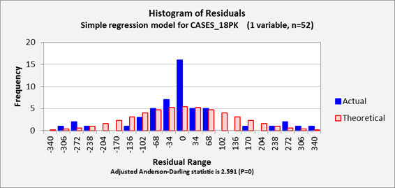
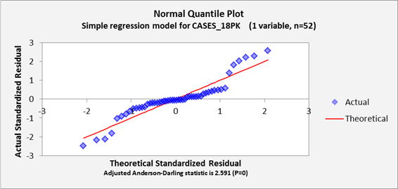
Lastly (at the bottom of this page), we have the residual histogram plot and normal
quantile plot which reveal the shape of the error distribution, along with
the Anderson-Darling statistic which
provides a numerical measure of the degree to which the error distribution is
non-normal. The importance of
testing for normality of the error distribution is that the formulas for
calculating confidence intervals for forecasts are based on properties of the
normal distribution. If the error
distribution is far from normal, then there will be some systematic over- or
under-estimation of “tail area probabilities”. Here, the outliers that are seen
in the histogram plot and the S-shaped pattern that is seen in the normal
quantile plot indicate a signficantly non-normal distribution, as does the A-D
stat, whose value of 2.591 is far above the 0.75 [1.04] critical value for
significance at the 0.05 [0.01] level.
The A-D stat, like other statistical tests for normality, should not be
given an exaggerated importance, particularly when sample sizes are very small
or very large. With very small
samples it is hard to determine much at all about the shape of the error
distribution and with very large samples even a tiny departure from normality
will show up as statistically significant.
(My own preference is to focus on shape of the pattern, if any, that is
seen on the normal quantile plot, and also to look closely at the most extreme
errors to try to figure out what went wrong there.) And like other diagnostic test
statistics for the model assumptions, the
A-D stat is not the bottom line, just a little red flag that may or may not
wave. Still, it provides some
sort of numerical benchmark to go along with the visual impressions of
non-normality that are obtained from the histogram and quantile plots.
What’s the bottom
line? Despite
its high R-squared value, this is not a good model. Its forecasts and their confidence
limits are illogical at high price levels. The relationship between beer
sales and beer price is evidently not linear over such a wide range in prices,
and the model also badly violates the homoscedasticity and normal-distribution
assumptions for the errors.
Let this be a warning: not all significant relationships are
linear, not all random variables are normally distributed, and not all models
with high R-squared values are good ones.
Go on to next step: variable transformations