6.11: LA & Phoenix, too.
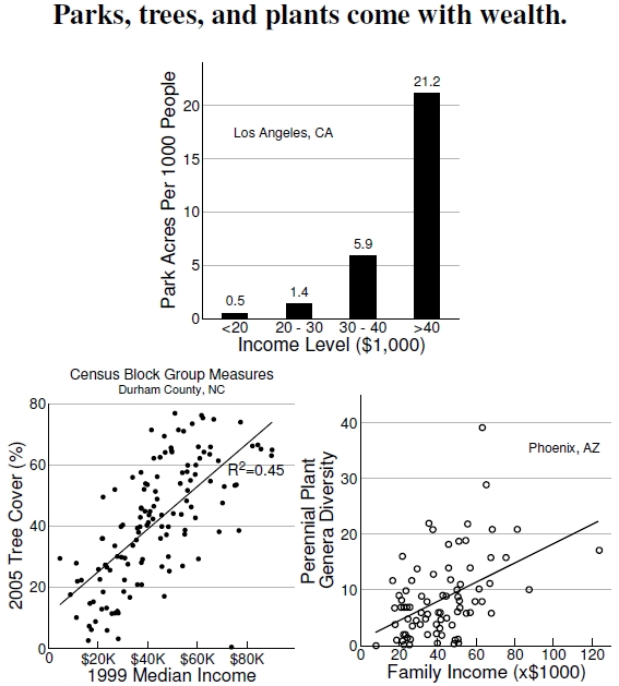
Figure 6.11: Top plot shows park provisioning in Los Angeles against 1990 median household income (after Wolch et al. 2005). Higher income groups have 40 times more park area per person. Bottom left graph shows the dependence of tree cover and income in Durham County, North Carolina, using the data in Figure 6.8. The bottom right plot shows that plant diversity increases with median family income around Phoenix, Arizona (after Hope et al. 2003).
Let’s put some of these visual inequity correlations into graphical form with results compiled from across the United States. At the top of Figure 6.11, results for Los Angeles demonstrate that wealthier people have access to more park acres per person.[37] The team producing these results also demonstrates that racial inequities exist in park provisioning (see Figure 6.12) and that park funding sometimes heightens the inequities when, for example, considered on a per-child basis. Resolving these inequities won’t be easy or cheap, but they might involve retrofitting vacant properties, public properties such as schools and libraries, and riverbeds.
At bottom left, I’ve also plotted data from Figure 6.8 showing how Durham County’s tree coverage depends on median income. These points plot the tree canopy against the median income averaged over the 129 census block groups from the 2000 Census for Durham County. The two variables correlate extremely strongly[38] with income explaining 45% of canopy coverage. Astonishingly, each additional $10K in median income means that a neighborhood has an additional 7% of its area covered by trees. These results demonstrate that Durham’s poorest citizens have less than 20% tree coverage, while its wealthiest residents have 70-80% tree coverage. However, note the outlier at an income level of about $72,000 and no canopy cover. That point could be either a newly cleared subdivision, like that pictured in Figure 2.17, or situated on a golf course with few trees. Of course, the correlation doesn’t reveal mechanism: Perhaps low-income areas have their trees chopped down and replaced with impervious surfaces, or, more likely, wealthier people choose to live where there are trees.
One last example, at bottom right, demonstrates an example of provisioning biodiversity, measured in terms of the number of plant genera (“genus” is the botanical classification above species) versus family income in Phoenix, Arizona.[39] This study examined 204 30 m-by-30 m plots across a variety of land-use classifications, including urban, desert, agricultural, and transportation. Although plant genera richness correlated significantly with family income, urban land use and elevation showed even stronger correlations. Previously, I showed results indicating that measures of well-being were heightened in parks with greater biodiversity; here we see inequitable distributions of biodiversity. Importantly, surveys of plant biodiversity have included horticultural species, and one of the mechanisms for maintaining the correlation with income arises through the maintenance cost of exotic species, leading to a phenomenon the researchers called the “luxury effect.”
———————————
[37]In a personal communication, Jennifer Wolch, the lead author of the Wolch et al. (2005) Los Angeles study, described the unique areas serviced by parks as “Theissen polygons.” A park’s polygon includes all locations that have that park as its closest one. Edges of adjoining polygons represent locations equidistant from two or more parks. These polygons cover the entire study area.
[38]The fit of median income and tree canopy across Durham County is significant with R2 = 0.45 and linear fit of form, y = 11.24 + 0.000696x.
[39]Hope et al. (2003) present the inequitable distribution of plant genera against family income in Phoenix, Arizona.

Hi Willis. Very interesting analysis. Being a statistician, I cannot help to think that your income by perennial plants may need a non-linear model. Though there is a lot of variability, it looks like it might be exponential.
I hope something positive in Durham and other locations across the US comes out of this research.
Right. I showed a simple linear fit; the primary publication is the ultimate resource!
Thanks, Will