6.14: Income, Education, & Life
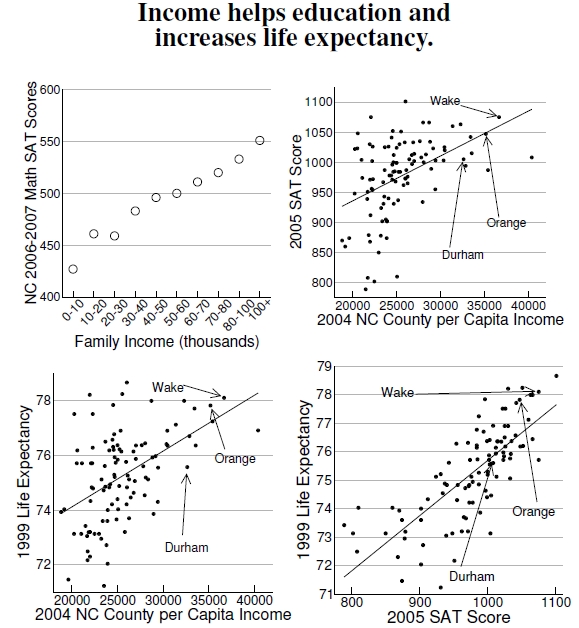
Figure 6.14: Top left graph shows how the North Carolina math SAT scores from the 2006-2007 academic year vary with self-reported family income (data from The College Board 2007 NC statistics). Top right graph plots the 2005 combined SAT scores against the 2004 per capita income for each county in North Carolina (data from www.ncpublicschools.org). Bottom plots show, for each North Carolina county, life expectancy (from Ezzati et al. 2008) versus income and combined SAT scores. Every $10,000 in per capita income or additional 100 SAT points yields about two additional years.
Again, let’s put urban nature into the proper context, as was done with the heat-related mortality of older people. Urban vegetation helps children develop positively, as previous results demonstrate, but are other factors more important? At top left of Figure 6.14, for example, are the Scholastic Aptitude Test (SAT) mathematics scores for the 2006-2007 academic year for North Carolina students. Students themselves reported these incomes,[47] and assuming the reported incomes aren’t too far off, family income shows a strong correlation with this developmental measure.[48] At top right, county-level data from North Carolina — 2005 combined SAT scores vs. 2004 per capita income—confirm a strong dependence on family income.[49] Certainly, some counties with low incomes perform very well, but students in counties with higher per capita incomes consistently perform better. As a result, for every $10,000 increase in a county’s per capita income, the county’s SAT scores increase by nearly 75 points.
Another set of correlations shows how county-level life expectancy increases with county-level per capita income and SAT score.[50] As plotted against per capita county income at bottom left, life expectancy mirrors SAT scores.[51] With this correlation, the data imply that every $10,000 in per capita income yields two additional years of life expectancy. In addition, the correlation between SAT scores and family income implies the obvious correlation between life expectancy and SAT score depicted here at bottom right.[52] According to the correlation, an additional 100 points on an SAT score implies an additional 1.9 years of life expectancy.
Remember, these plots show correlations, not causation or mechanism, and the two correlations with life expectancy should be expected because of the correlation between income and SAT score. Mechanistically, perhaps people with higher incomes can afford better health care. Perhaps people with higher SAT scores know how to live in a more healthful manner. Perhaps some other aspect of people’s lives underpins both these correlations. Precisely because these correlations exist, scientists should have the resources to uncover their underlying causes.
So, is urban nature beneficial to childhood development? Figure 5.10 showed that effect, so the answer is yes; further, I suspect that effect carries across different cities. But is it a strong effect? Assuming SAT scores correctly measure well-developed children, many factors beyond vegetation, associated with family income, help children develop positively.
——————————
[47]Unfortunately, students themselves reported these incomes. Perhaps, kids doing poorly on the SATs might preferentially underestimate family incomes, and students doing well might overestimate family income. Of course, I can also imagine the exact opposite situation.
[48]The College Board from which this SAT–income data originated was unclear whether the reported standard deviation of around 100 points was with respect to the distribution or the mean, but given the SAT scores, 100 points certainly looks like a reasonable value for the standard deviation. To understand the trends better, I have assumed so and calculated the standard deviation of the means — also called the standard error — which is much smaller, roughly 2 points, smaller than the plotting symbols.
[49]The data show no connection between percentage of students tested and combined SAT scores at the county level. The fit of 2005 SAT scores and 2004 per capita income is significant with R2 = 0.21 and linear fit of form, y = 787 + 0.00746x.
[50]Ezzati et al. (2008) provide county-level life expectancy data and show increased disparity in life expectancy with economic status.
[51]The fits for life expectancy versus income in Figure 6.14, is significant with R2=0.24; fitting the functional form, y = 70.0 + 0.00020x.
[52]The fits for life expectancy versus SAT score in Figure 6.14 is significant with R2=0.57; fitting the functional form, y = 56.3 + 0.019x.
