6. 5 Deadly City Heat
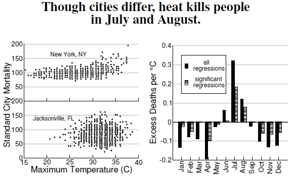
Figure 6.5: At left, plots from New York City and Jacksonville, Florida, summarize data from the 1960s, 1970s, and 1980, showing how mortality varies with maximum temperature. Floridians seem to deal better with high heat, an idea that is borne out by a broader examination of regional mortality patterns (after Kalkstein and Davis 1989). The graph at right displays excess heat-related deaths per °C using data from 28 metropolitan areas over the years 1964–1998 (after Davis et al. 2004).
Plots from Jacksonville, Florida, and New York City, along with many other U.S. cities, combine data on deaths during the years 1964–1966, 1972–1978, and 1980 (all years lumped together) and consider them against temperature and other environmental variables, such as airspeed, dewpoint, and degree cooling and heating hours (Figure 6.5).[19] In order to compare death rates in all of these socioeconomically and geographically disparate cities, scientists calculate a standardized mortality to facilitate this cross-comparison (see Figure 6.7).
Plotting this standard mortality against temperatures for each day for a northern city and a southern city, in the left plot, reveals some evidence behind the idea of acclimating to heat. If a city doesn’t experience extreme temperatures, then heat waves are quite problematic, but if a city is always hot, then what’s a few degrees more? Citizens of hot cities apparently know how to deal with heat better than people in cities with more variable temperatures.
Indeed, two summer weather systems — dry tropical air masses and very warm and humid tropical air masses — in cities exceeding 1 million people cause significant mortality increases.[20] Total estimated deaths attributed to summer heat in 44 U.S. cities exceeded 1,800 per summer season, with the elderly being more susceptible. Furthermore, climate change models predict two to six times greater frequencies of these air masses above current levels, with expectations for overall mortality increasing by a factor of up to three.
Data regarding monthly mortality come from the National Center for Health Statistics, covering the years 1964–1966 and 1973–1998 for 28 metropolitan areas: 29 years worth of daily data on mortality and temperature.[21] Think about all the problems faced when comparing death rates in different cities in 1950, 1975, and 2000. Not only did the distribution of ages change differently in different places, so did the technologies associated with health care and automobile emissions regulations. There is just one complicating example: Increased air conditioning from the 1980s to the 1990s greatly reduced mortality (see Figure 6.6). The scientists doing this work had to deal with these problems while untangling their question of how higher temperatures affects mortality. Let it suffice that there are “accepted” ways to standardize these mortality rates (see Figure 6.7).[22]
In the right-hand graph, after applying these standardizations, we see the expected increase in heat-related deaths, measured against a one degree Celcius temperature increase.[23] This plot’s message: Summer heat is a bad thing, winter heat is a good thing.
——————————–
[19]Kalkstein and Davis (1989) present the mortality versus temperature plots, along with a great deal of further analyses. My digitization of their plots gave around 250 points per plot for the summer months of these 11 years; 11 years times 90 days would be 990 points. I believe the authors plotted each day of the three summer months for each of the 11 years, but many points sit on top of one another (they make no explicit statement clarifying this point in the paper). I dropped an off-axis point for New York City having a standard mortality of 250 at 40C.
[20]Kalkstein and Greene (1997) discuss weather patterns and mortality, as well as heat-related mortality increases with global warming.
[21]Davis et al. (2003, 2004) performed the analysis of heat-related deaths in 28 metropolitan areas.
[22]Anderson and Rosenberg (1998) describe standardized mortality calculations.
[23]Chip Knappenberger, one of the authors of the Davis et al. (2003, 2004) studies, writes, “For our purposes, which were to best isolate a weather component as a cause of mortality, we age-standardized to remove changing population demographic effects from the annual mortality numbers, just as the CDC recommends in order to compare from place to place and from time to time. Once we had best taken care of demographic issues, we still had a big trend to deal with — presumably related to technology improvements (medicine, etc.) as well as a seasonal cycle. We attempted to remove those effects by subtracting the monthly median daily mortality (for a particular month-year) in order to arrive at daily mortality anomalies, which we then related to weather variables (specifically 1600LST apparent temperature).”
