6.12: Minorities, Air, & Asthma
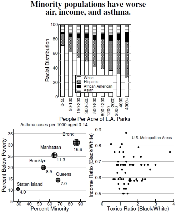
 Figure 6.12: Top graph shows park provisioning in Los Angeles (after Sister et al. 2007). Bottom left graph shows that asthma hospitalizations differ between the boroughs of New York City, increasing with percentage of minority population and poverty level (after Maantay 2007). Circle area scales with the number of cases. Right plot shows the toxics and income ratios of blacks to non-Hispanic whites for 61 metropolitan areas across the United States. Independence of racial background occurs when both ratios equal one (after Downey 2007).
Indications of racial inequities in vegetation and tree canopy coverage come through in the correlations of Figure 6.9; in Figure 6.12 I show several results that make those inequities clearer. At top I show the racial distribution of park provisioning in Los Angeles. This study, associated with the Los Angeles study in Figure 6.11, determined the number of people sharing each park available to citizens.[40] Essentially, think of the number of people per park as the number of people for which that park is their closest one. When parks are abundant, or population densities are low, a park has very few people, and when parks are far and few between, or population densities are very high, a park has many people. In Los Angeles, parks that service relatively few people have racial distributions dominated by whites, but parks with relatively many people (100 times more than the lowest population levels) service predominantly Hispanic populations.
The bottom two plots link racial and economic condition. The bottom left graph shows the asthma hospitalization rates per 1,000 children across the boroughs of New York City, plotted against each borough’s poverty rate and percentage minority population.[41] Extending this observation of inequity nationwide, a study of the 61 largest metropolitan areas (areas of more than 1 million people) across the continental United States is shown in the bottom right graph.[42] These data rely, in part, on the “segregation index”— an important statistic that defines the fraction of the minority population that would need to move to achieve an even distribution across the metropolitan area. Over these cities, in the year 2000, the segregation index varied from 84 down to 37. With this statistic, the ratio of the median household income for blacks and whites spanning these metropolitan areas varies from a low of 0.5. This means that whites have twice the household income, on average, as blacks in the most segregated cities, up to the highest income ratio of 0.88 in the most integrated cities. Another inequity measure, the “toxics value,” compares different kinds of air pollution in different locations by weighting each pollutant by its toxicity. The “toxics ratio” defines the relative toxics value in black and white neighborhoods in these metropolitan areas. The bottom right plot shows the racial inequity of income and air pollution, which reflects the results found for tree cover and racial and socioeconomic correlations.
The Raleigh–Durham–Chapel Hill area has a segregation value of 46.2, a black-to-white income ratio of 0.59, and a black-to-white toxics ratio of 1.54. These values put this area in a roughly average situation. It seems reasonable to assume that a similar inequity exists in asthma hospitalizations and park provisioning, for example, but that would only be a guess.
———————————————
[40]Sister et al. (2007) connected the park provisioning to racial distributions in Los Angeles, California. A park’s service area was determined as discussed in a note for Figure 6.11.
[41]Maantay (2007) shows racial and poverty inequities in New York City.
[42]Downey (2007) examines racial inequities in income and air quality in MSAs across the United States.