6. 7 Winter Deaths
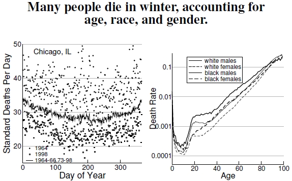
 Figure 6.7: At left I show standard deaths per day versus day of year for Chicago, Illinois (data courtesy of Chip Knappenberger). Day 1 denotes the first of January, and Day 365 denotes December 31. These numbers relate to a “standardized” population of 1 million people. Data points indicate two different years, 1964 (filled circles) and 1998 (open squares), and the solid line gives the long-term average over 1964-1968 and 1973-1998. Winter mortality exceeds summer mortality, while standard mortality has greatly declined since the 1960s. At right, the graph displays raw mortality rates for white and black men and women in the year 2005, dividing the number of deaths at each age in that year by the July 2005 population of that age (data from the CDC and U.S. Census).
I want to place heat-related mortality into an appropriate context. Determining heat-related mortality in the previous plots relies, in some cases, on standardized mortality, and I show one such example of standardized mortality for Chicago, Illinois.[28] Differences in age distributions, health technology, and other variables across years and places means that mortality data must be “corrected” to make a meaningful comparison. These data show that winter mortality, scaled as daily deaths per million people, exceeds summer mortality. It’s not clear why. Perhaps during summer heat, old people stay indoors rather than playing outside with chainsaws. Perhaps in winter darkness, people stay inside more, passing around infectious diseases. Seasonal behavioral choices like these might result in summer heat promoting safer indoor activities. If indeed heat changes behavior, conclusions regarding global warming and mortality rates in the coming decades become complicated by how we’ll behave.
What mortality rate do we expect for a city of 1 million people? If a person lives for 80 years, that’s a total of 29,220 days of life. If every day were like every other day, dividing 1 million by 29,220, we should expect roughly 34 deaths each day (and, happily, 34 births). This rough number doesn’t work out too badly compared to the y-axis of Figure 6.7. Still, I’m a little uneasy. The average daily standardized mortality during the 1990s is just 26 deaths per day. Dividing 1 million people by 26 deaths per day gives a lifetime of about 38,500 days, or roughly 105 years of age. I know that number is too high.
Looking at actual mortality rates a bit deeper, the National Center for Health Statistics reports that the crude death rate (meaning the actual number of people who died in a year, not a corrected number) for 100,000 people in 2004 was 816.5, down from 963.8 in 1950. In contrast, standardized mortality rates differed greatly; in 2004 it was 800.8, but in 1950 it was 1,446.0. Surprise, surprise: We live longer now than in 1950, but standardized mortality makes the picture really rosy. Why? The underlying death rates for different ages are tremendously different. Indeed, the mortality rate plot on the right, which simply divides deaths by populations of specific categories of age, race, and gender, shows how drastically these values differ between young and old, male and female, black and white.[29] Another way to describe these differences is as follows: In 2004 the crude death rates for 100,000 people in age ranges 5-9, 45-49, and 75-79 were, respectively, 14.7, 352.3, and 4,193.2. Those are drastically different values, and any changes in the distribution of ages, whether because of a change in time or location, makes comparing death rates a tough problem.[30]
Also note the high mortality rates for the elderly and the rather small contribution from heat-related deaths (see Figure 6.1).
————————————–
[28]The standardized mortality data shown in Figure 6.7 was kindly provided by Chip Knappenberger, a coauthor of the Davis et al. (2003, 2004) work. See Figure 6.5’s notes for further discussion.
[29]I found age-specific mortality data at the CDC’s National Center for Health Statistics website, specifically Worktable 310, www.cdc.gov/nchs/datawh/statab/unpubd/mortabs/gmwk310_10.htm. I found the population estimates for each age, sex, and race cohort from the U.S. Census site, www.census.gov/popest/national/asrh/2007-nat-res.html. My results simply divide the number of deaths by the population.
[30]As one important example, countries go through “demographic transitions” in which a developing economy experiences decreasing mortality rates while maintaining high birth rates. As a result, the population rapidly increases with many more younger people. As the country develops later, the birth rate declines, the pulse of young people age, and the contracting population has relatively more older people. Average mortality rate changes throughout this period, and uncovering the effects of heat and air pollution out from under the stronger age-dependent signal must be difficult.