6.13: Wealth & Health
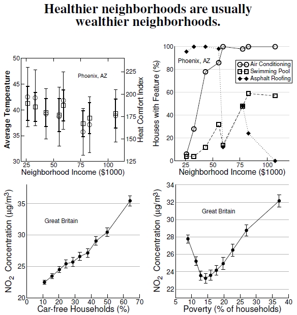
Figure 6.13: Top left graph shows that a neighborhood’s average temperature and heat comfort index (lower values indicate more comfort), and at top right, various “cool home” features, depend on average income in Phoenix, Arizona (data from Harlan et al. 2006). Error bars reflect standard deviations; both the temperature and heat comfort indexes decrease significantly with income. Averaged over all wards in Great Britain, the bottom plots show that NO2 pollution is higher, remarkably, in wards with lower car ownership (at left) and in wards with higher poverty (after Mitchell and Dorling 2003).
Better environments tend to be found in wealthier areas, but people’s choices complicate the patterns. Matching expectations, the top graphs in Figure 6.13 report temperatures (measured at 5 PM during the summer of 2003) were higher in poorer neighborhoods, as well as the heat comfort level, in Phoenix, Arizona, where this study was performed.[43] Although the error bars look large, they’re standard deviations,[44] the temperatures had significant differences, and the dependence of heat comfort on income was also significant. Researchers also found that vegetation was significantly correlated with the heat comfort index, and we’ve already seen one case of vegetation being correlated with income in Figure 6.10. One question with these results, perhaps, is that, although the correlations with income are significant, are the correlations important? Maybe everyone in Phoenix is uncomfortably hot, but those with high income are a little less uncomfortable: Is there a cool spot in the oven? The importance, in this sense, isn’t completely clear.
Another important point is that in a place like Phoenix, where water is in short supply, having lots of vegetation must be considered carefully because of the water demands. In Durham, North Carolina, we get plenty of rainfall — except for the occasional, exceptional drought and seasonal summer dryness — so water isn’t usually a limiting problem for promoting vegetation.
Results from the Great Britain study on NO2 correlations break the stereotyped expectations. Pollution levels decreased with greater car ownership, at bottom left, because urban areas have higher pollution levels, along with a reduced need for car ownership if you live there.[45] Some neighborhoods have high pollution levels, but these people own few cars and have low emissions. People from outlying areas drive their cars to these urban areas, and the urban dwellers have to breathe the result. In some sense, this situation illustrates an environmental injustice because these people breathe pollution not of their own making, but one moderates one’s sympathies because these folks have chosen a trendy urban lifestyle over cleaner air in wealthy suburban neighborhoods. This choice also drives the higher pollution levels at low poverty levels at bottom right. The real environmental injustice occurs because some of the people in some of these urban areas experience greater poverty than average, breathe others’ pollution, but can’t afford to move to healthier environments.
Talking about equity, health, and vegetation presents a complicated picture. Another study, this time of England alone, found that vegetation promoted good health in urban areas and for the rural poor, but not for the rural wealthy and the suburban poor. Rural wealthy residents don’t rely on public greenspace provisioning. Moreover, the study found that poor suburban residents have generally worse health and lower quality greenspace, but specific mechanisms remain unclear.[46]
—————————–
43Harlan et al. (2006) examined the heat comfort index with average income in Phoenix, Arizona.
44See Figure A.6 for a discussion of the differences between standard deviations and standard errors.
45Mitchell and Dorling (2003) studied NO2 pollution over all wards in Great Britain. This fascinating study looked at many different features concerning who pollutes and who breathes the pollution.
46Mitchell and Popham (2007) studied health across England.
