from __future__ import division
import os
import sys
import glob
import matplotlib.pyplot as plt
import numpy as np
import pandas as pd
%matplotlib inline
%precision 4
plt.style.use('ggplot')
np.random.seed(1234)
import pymc3 as pm
import scipy.stats as stats
import logging
_logger = logging.getLogger("theano.gof.compilelock")
_logger.setLevel(logging.ERROR)
Using PyMC3
Install PyMC3 directly from GitHub with
pip install --process-dependency-links git+https://github.com/pymc-devs/pymc3
PyMC3 is alpha software that is intended to improve on PyMC2 in the following ways (from GitHub page):
- Intuitive model specification syntax, for example, x ~ N(0,1) translates to x = Normal(0,1)
- Powerful sampling algorithms such as Hamiltonian Monte Carlo
- Easy optimization for finding the maximum a posteriori point
- Theano features
- Numpy broadcasting and advanced indexing
- Linear algebra operators
- Computation optimization and dynamic C compilation
- Simple extensibility
It also comes with extensive examples including ports of the R/JAGS code examples from Doing Bayesian Data Analysis.
However, the API is different and it is not backwards compartible with models specified in PyMC2.
Coin toss
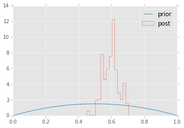
We’ll repeat the example of determining the bias of a coin from observed coin tosses. The likelihood is binomial, and we use a beta prior.
Note the different API from PyMC2.
n = 100
h = 61
alpha = 2
beta = 2

niter = 1000
with pm.Model() as model: # context management
    # define priors
    p = pm.Beta('p', alpha=alpha, beta=beta)

    # define likelihood
    y = pm.Binomial('y', n=n, p=p, observed=h)

    # inference
    start = pm.find_MAP() # Use MAP estimate (optimization) as the initial state for MCMC
    step = pm.Metropolis() # Have a choice of samplers
    trace = pm.sample(niter, step, start, random_seed=123, progressbar=True)
[-----------------100%-----------------] 1000 of 1000 complete in 0.2 sec
plt.hist(trace['p'], 15, histtype='step', normed=True, label='post');
x = np.linspace(0, 1, 100)
plt.plot(x, stats.beta.pdf(x, alpha, beta), label='prior');
plt.legend(loc='best');
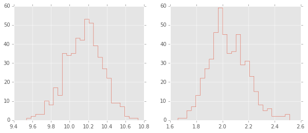
Estimating mean and standard deviation of normal distribution
# generate observed data
N = 100
_mu = np.array([10])
_sigma = np.array([2])
y = np.random.normal(_mu, _sigma, N)

niter = 1000
with pm.Model() as model:
    # define priors
    mu = pm.Uniform('mu', lower=0, upper=100, shape=_mu.shape)
    sigma = pm.Uniform('sigma', lower=0, upper=10, shape=_sigma.shape)

    # define likelihood
    y_obs = pm.Normal('Y_obs', mu=mu, sd=sigma, observed=y)

    # inference
    start = pm.find_MAP()
    step = pm.Slice()
    trace = pm.sample(niter, step, start, random_seed=123, progressbar=True)
[-----------------100%-----------------] 1000 of 1000 complete in 1.9 sec
plt.figure(figsize=(10,4))
plt.subplot(1,2,1);
plt.hist(trace['mu'][-niter/2:,0], 25, histtype='step');
plt.subplot(1,2,2);
plt.hist(trace['sigma'][-niter/2:,0], 25, histtype='step');
Estimating parameters of a linear regreession model
We will show how to estimate regression parameters using a simple linear modesl
We can restate the linear model
as sampling from a probability distribution
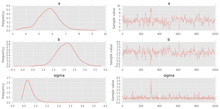
Now we can use pymc to estimate the paramters \(a\), \(b\) and \(\sigma\) (pymc2 uses precision \(\tau\) which is \(1/\sigma^2\) so we need to do a simple transformation). We will assume the following priors
# observed data
n = 11
_a = 6
_b = 2
x = np.linspace(0, 1, n)
y = _a*x + _b + np.random.randn(n)

with pm.Model() as model:
    a = pm.Normal('a', mu=0, sd=20)
    b = pm.Normal('b', mu=0, sd=20)
    sigma = pm.Uniform('sigma', lower=0, upper=20)

    y_est = a*x + b # simple auxiliary variables

    likelihood = pm.Normal('y', mu=y_est, sd=sigma, observed=y)
    # inference
    start = pm.find_MAP()
    step = pm.NUTS() # Hamiltonian MCMC with No U-Turn Sampler
    trace = pm.sample(niter, step, start, random_seed=123, progressbar=True)
    pm.traceplot(trace);
[-----------------100%-----------------] 1000 of 1000 complete in 8.9 sec
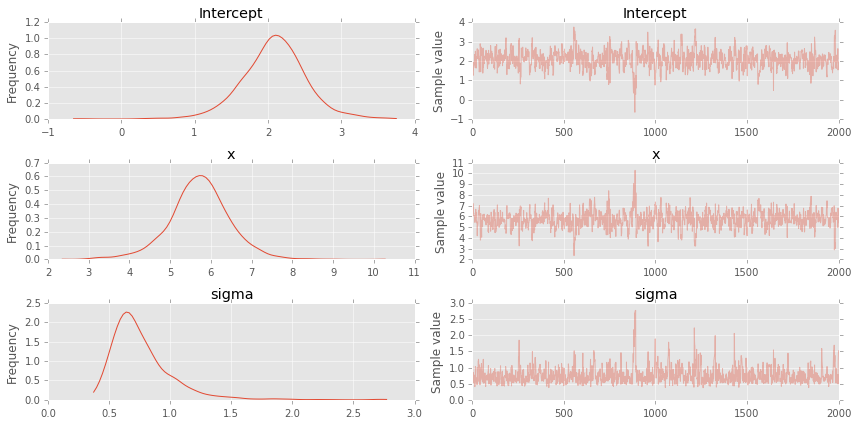
Alternative fromulation using GLM formulas
data = dict(x=x, y=y)

with pm.Model() as model:
    pm.glm.glm('y ~ x', data)
    step = pm.NUTS()
    trace = pm.sample(2000, step, progressbar=True)
[-----------------100%-----------------] 2000 of 2000 complete in 8.1 sec
pm.traceplot(trace);
plt.figure(figsize=(7, 7))
plt.scatter(x, y, s=30, label='data')
pm.glm.plot_posterior_predictive(trace, samples=100,
                                 label='posterior predictive regression lines',
                                 c='blue', alpha=0.2)
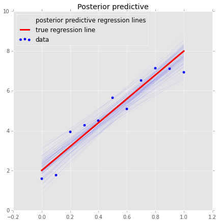
plt.plot(x, _a*x + _b, label='true regression line', lw=3., c='red')
plt.legend(loc='best');
Simple Logistic model
We have observations of height and weight and want to use a logistic model to guess the sex.
# observed data
df = pd.read_csv('HtWt.csv')
df.head()
| male | height | weight | |
|---|---|---|---|
| 0 | 0 | 63.2 | 168.7 |
| 1 | 0 | 68.7 | 169.8 |
| 2 | 0 | 64.8 | 176.6 |
| 3 | 0 | 67.9 | 246.8 |
| 4 | 1 | 68.9 | 151.6 |
niter = 1000
with pm.Model() as model:
    pm.glm.glm('male ~ height + weight', df, family=pm.glm.families.Binomial())
    trace = pm.sample(niter, step=pm.Slice(), random_seed=123, progressbar=True)
[-----------------100%-----------------] 1000 of 1000 complete in 3.2 sec
# note that height and weigth in trace refer to the coefficients

df_trace = pm.trace_to_dataframe(trace)
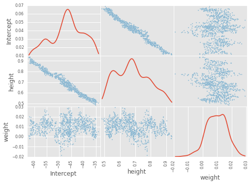
pd.scatter_matrix(df_trace[-1000:], diagonal='kde');
plt.figure(figsize=(12, 4))
plt.subplot(121)
plt.plot(df_trace.ix[-1000:, 'height'], linewidth=0.7)
plt.subplot(122)
plt.plot(df_trace.ix[-1000:, 'weight'], linewidth=0.7);
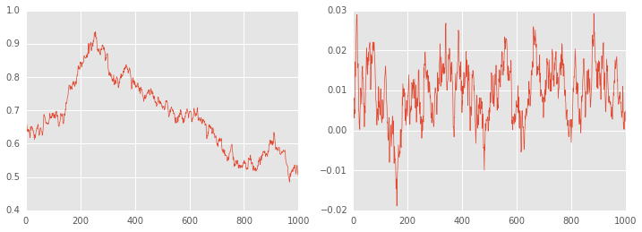
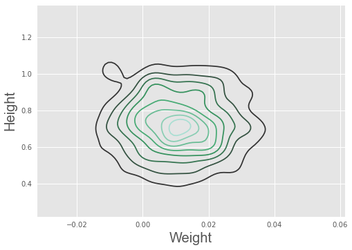
There is no convergence!
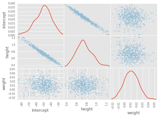
Becaue of ths strong correlation between height and weight, a one-at-a-time sampler such as the slice or Gibbs sampler will take a long time to converge. The HMC does much better.
niter = 1000
with pm.Model() as model:
    pm.glm.glm('male ~ height + weight', df, family=pm.glm.families.Binomial())
    trace = pm.sample(niter, step=pm.NUTS(), random_seed=123, progressbar=True)
[-----------------100%-----------------] 1001 of 1000 complete in 27.0 sec
df_trace = pm.trace_to_dataframe(trace)
pd.scatter_matrix(df_trace[-1000:], diagonal='kde');
pm.summary(trace);
Intercept:

  Mean             SD               MC Error         95% HPD interval
  -------------------------------------------------------------------

  -51.393          11.299           0.828            [-73.102, -29.353]

  Posterior quantiles:
  2.5            25             50             75             97.5
  |--------------|==============|==============|--------------|

  -76.964        -58.534        -50.383        -43.856        -30.630


height:

  Mean             SD               MC Error         95% HPD interval
  -------------------------------------------------------------------

  0.747            0.170            0.012            [0.422, 1.096]

  Posterior quantiles:
  2.5            25             50             75             97.5
  |--------------|==============|==============|--------------|

  0.453          0.630          0.732          0.853          1.139


weight:

  Mean             SD               MC Error         95% HPD interval
  -------------------------------------------------------------------

  0.011            0.012            0.001            [-0.012, 0.034]

  Posterior quantiles:
  2.5            25             50             75             97.5
  |--------------|==============|==============|--------------|

  -0.012         0.002          0.010          0.019          0.034
import seaborn as sn
sn.kdeplot(trace['weight'], trace['height'])
plt.xlabel('Weight', fontsize=20)
plt.ylabel('Height', fontsize=20)
plt.style.use('ggplot')
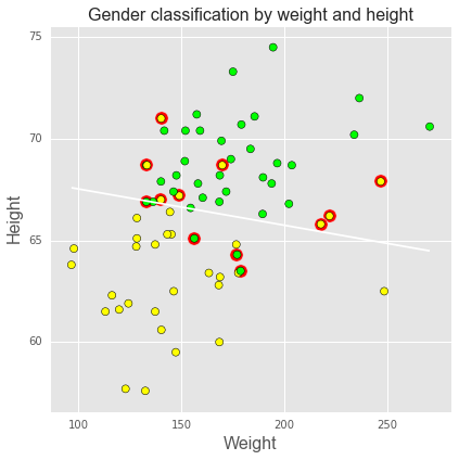
We can use the logistic regression results to classify subjects as male or female based on their height and weight, using 0.5 as a cutoff, as shown in the plot below. Green = true positive male, yellow = true positive female, red halo = misclassification. Blue line shows the 0.5 cutoff.
intercept, height, weight = df_trace[-niter//2:].mean(0)

def predict(w, h, height=height, weight=weight):
    """Predict gender given weight (w) and height (h) values."""
    v = intercept + height*h + weight*w
    return np.exp(v)/(1+np.exp(v))

# calculate predictions on grid
xs = np.linspace(df.weight.min(), df.weight.max(), 100)
ys = np.linspace(df.height.min(), df.height.max(), 100)
X, Y = np.meshgrid(xs, ys)
Z = predict(X, Y)

plt.figure(figsize=(6,6))

# plot 0.5 contour line - classify as male if above this line
plt.contour(X, Y, Z, levels=[0.5])

# classify all subjects
colors = ['lime' if i else 'yellow' for i in df.male]
ps = predict(df.weight, df.height)
errs = ((ps < 0.5) & df.male) |((ps >= 0.5) & (1-df.male))
plt.scatter(df.weight[errs], df.height[errs], facecolors='red', s=150)
plt.scatter(df.weight, df.height, facecolors=colors, edgecolors='k', s=50, alpha=1);
plt.xlabel('Weight', fontsize=16)
plt.ylabel('Height', fontsize=16)
plt.title('Gender classification by weight and height', fontsize=16)
plt.tight_layout();
Estimating parameters of a logistic model
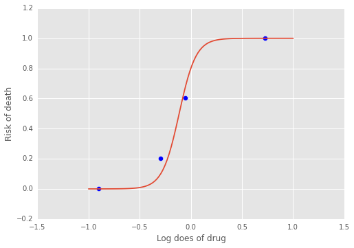
Gelman’s book has an example where the dose of a drug may be affected to the number of rat deaths in an experiment.
| Dose (log g/ml) | # Rats | # Deaths |
|---|---|---|
| -0.896 | 5 | 0 |
| -0.296 | 5 | 1 |
| -0.053 | 5 | 3 |
| 0.727 | 5 | 5 |
We will model the number of deaths as a random sample from a binomial distribution, where \(n\) is the number of rats and \(p\) the probabbility of a rat dying. We are given \(n = 5\), but we believve that \(p\) may be related to the drug dose \(x\). As \(x\) increases the number of rats dying seems to increase, and since \(p\) is a probability, we use the following model:
where we set vague priors for \(\alpha\) and \(\beta\), the parameters for the logistic model.
# observed data
n = 5 * np.ones(4)
x = np.array([-0.896, -0.296, -0.053, 0.727])
y = np.array([0, 1, 3, 5])

def invlogit(x):
    return pm.exp(x) / (1 + pm.exp(x))

with pm.Model() as model:
    # define priors
    alpha = pm.Normal('alpha', mu=0, sd=5)
    beta = pm.Flat('beta')

    # define likelihood
    p = invlogit(alpha + beta*x)
    y_obs = pm.Binomial('y_obs', n=n, p=p, observed=y)

    # inference
    start = pm.find_MAP()
    step = pm.NUTS()
    trace = pm.sample(niter, step, start, random_seed=123, progressbar=True)
[-----------------100%-----------------] 1000 of 1000 complete in 2.5 sec
np.exp
<ufunc 'exp'>
f = lambda a, b, xp: np.exp(a + b*xp)/(1 + np.exp(a + b*xp))

xp = np.linspace(-1, 1, 100)
a = trace.get_values('alpha').mean()
b = trace.get_values('beta').mean()
plt.plot(xp, f(a, b, xp))
plt.scatter(x, y/5, s=50);
plt.xlabel('Log does of drug')
plt.ylabel('Risk of death');
Using a hierarchcical model
This uses the Gelman radon data set and is based off this IPython notebook. Radon levels were measured in houses from all counties in several states. Here we want to know if the preence of a basement affects the level of radon, and if this is affected by which county the house is located in.
The data set provided is just for the state of Minnesota, which has 85
counties with 2 to 116 measurements per county. We only need 3 columns
for this example county, log_radon, floor, where floor=0
indicates that there is a basement.
We will perfrom simple linear regression on log_radon as a function of county and floor.
radon = pd.read_csv('radon.csv')[['county', 'floor', 'log_radon']]
radon.head()
| county | floor | log_radon | |
|---|---|---|---|
| 0 | AITKIN | 1 | 0.832909 |
| 1 | AITKIN | 0 | 0.832909 |
| 2 | AITKIN | 0 | 1.098612 |
| 3 | AITKIN | 0 | 0.095310 |
| 4 | ANOKA | 0 | 1.163151 |
With a hierarchical model, there is an \(a_c\) and a \(b_c\) for each county \(c\) just as in the individual couty model, but they are no longer indepnedent but assumed to come from a common group distribution
we furhter assume that the hyperparameters come from the following distributions
county = pd.Categorical(radon['county']).codes

with pm.Model() as hm:
    # County hyperpriors
    mu_a = pm.Normal('mu_a', mu=0, tau=1.0/100**2)
    sigma_a = pm.Uniform('sigma_a', lower=0, upper=100)
    mu_b = pm.Normal('mu_b', mu=0, tau=1.0/100**2)
    sigma_b = pm.Uniform('sigma_b', lower=0, upper=100)

    # County slopes and intercepts
    a = pm.Normal('slope', mu=mu_a, sd=sigma_a, shape=len(set(county)))
    b = pm.Normal('intercept', mu=mu_b, tau=1.0/sigma_b**2, shape=len(set(county)))

    # Houseehold errors
    sigma = pm.Gamma("sigma", alpha=10, beta=1)

    # Model prediction of radon level
    mu = a[county] + b[county] * radon.floor.values

    # Data likelihood
    y = pm.Normal('y', mu=mu, sd=sigma, observed=radon.log_radon)
with hm:
    start = pm.find_MAP()
    step = pm.NUTS(scaling=start)
    hm_trace = pm.sample(2000, step, start=start, random_seed=123, progressbar=True)
[-----------------100%-----------------] 2001 of 2000 complete in 1295.7 sec
plt.figure(figsize=(8, 60))
pm.forestplot(hm_trace, vars=['slope', 'intercept']);
<matplotlib.gridspec.GridSpec at 0x15d4808d0>
