2. 2 Trees & Temp (Indianapolis)
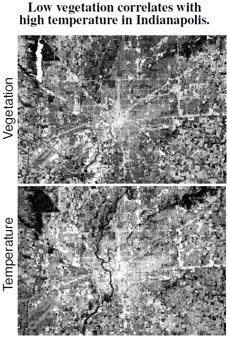
Figure 2.2: Satellite images of Indianapolis, Indiana, taken at 11:15 AM on June 6, 2000, show correlations between vegetation (top image; light areas have low vegetation) and temperature (bottom image; light areas are warm). For spatial scale, note the 3.2 km long lake in the upper left; the total horizontal distance is roughly 18 km. A plot of the numerical data from these two images, in Figure 2.3, indicates the range of temperatures and relative vegetation values. (Images courtesy of Jeff Wilson.)
The city of Durham, North Carolina, isn’t alone when it comes to high temperatures. Indianapolis, Indiana, also possesses a correlation between vegetation and temperature.[5] In this case, think of anything but impervious surface as vegetation, including lawns, forests, streams, and lakes, and the lack of vegetation (light areas) in the central portion marks the urban core with residential, commercial, and industrial land uses. Getting vegetative cover and land surface temperature from a satellite sounds complicated. The satellite measures the light (from the entire spectrum) reaching it in its orbit, and this light includes land and atmospheric radiation, the latter needing removal to uncover the portion from land. As for the measure of vegetation, the normalized difference vegetation index (NDVI), and its calculation using GIS software is also rather complicated, involving details of the light spectrum reaching the satellite.[6]
The overall length scale in these images for Indianapolis (Figure 2.2), as well as for Durham in Figure 2.1, is roughly 20 km. That scale brings up an interesting comparison with our atmosphere because the lower 10 km, the troposphere, holds roughly 80% of our air mass. An even shallower layer of the atmosphere, the “planetary boundary layer,” defines the upward extent of the atmosphere mixed up by interactions with trees, hills, buildings, and what-not.[7] This layer extends upward only about a few kilometers, quite a bit lower than the height of the troposphere (except, perhaps, in mountainous terrain).
In this image, take note of the unvegetated warm area of 1 km in size right in the center, about a third the length of the long lake at upper left. The urban heat island extends about 1 km high, so project that distance up off the page. Like a deep, slow river flowing over a bed of rocks, the atmospheric flows above the planetary boundary layer don’t feel the bumps in the terrestrial surface. These cities’ 20-km hotspots are not only wider than the atmosphere is thick, but they’re much wider than the normal planetary boundary layer is high. Imagine putting a really powerful hotplate at the bottom of a stream, where it heats water at the bottom that rises toward the surface. A city isn’t some small toaster; rather, it’s a huge burner whose effects roil the surface, like a huge boulder, with effects felt far downstream. The urban heat island is a virtual mountain of hot air poking out high above the clouds.
In short, anywhere in the world where there’s a city, there’s an urban heat island.[8]
—————-
[5]Vegetation and temperature correlation images from Indianapolis, Indiana, were provided by Jeff Wilson, and are discussed in depth in Wilson et al. (2003). Another set of images showing temperature and land use for Indianapolis can be found in Weng et al. (2004), and shows the same correlation as vegetation. It seems likely that places with low vegetation in a city are simply the places where there are high industrial and commercial densities because you can’t have two different things in the same place.
[6]Vose et al. (2003) describe and review the normalized difference vegetation index (NDVI) calculation very well.
[7]Arnfield (2003) reviews urban boundary layer science.
[8]Yet another example of an urban heat island comes from Hydarabad, India, a city of nearly 4 million people, where satellite measurements indicate a UHI of about 7C (Badarinath et al. 2005).
