2. 3 Temps & Vegetation
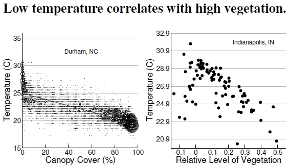
Figure 2.3: These data come from the canopy and temperature images in Figures 2.1 and 2.2: Randomly selected spots in Durham County, North Carolina (top), and various planned developments in Indianapolis, Indiana (bottom). The top plot shows that in Durham, having full canopy cover provides a 5C (9F) temperature reduction compared with having just 10% cover. Removing that last bit of cover, going from 10% to zero, results in several degrees more warming. Indianapolis sees similar effects under a relative measure of vegetation, but with interesting outliers (after Wilson et al. 2003).
The Durham and Indianapolis maps in Figures 2.1 and 2.2 provide nice visual connections between vegetation and temperature, but lack easy interpretations of the correlation strength between vegetation and temperature. Here in Figure 2.3, vegetation and temperature values plotted against one another inform deeper statistical questions. From the Durham satellite images, sampling just 1% of the pixels provides more than 8,000 points making up the left-hand plot. Many of these points had identical vegetation–temperature values, so I plot larger circles when many locations had identical values.
What do we see? At the middle of the morning on this spring day, the temperature at a location with zero percent canopy fraction was typically 25C, or 77F. In contrast, the temperature in 100% vegetated forest was 19.3C, or 66.7F. Vegetation keeps areas cooler by up to 10F! Though these data come from an early spring morning, I expect similar temperature differences on a hot summer day, meaning a cool 90F in the forest versus a baking 100F in the city.
The Indianapolis plot at right addresses specific urban planning questions. Each of the 88 points plotted here represents a planned development (think “subdivision”), with its temperature and vegetation signature measured by satellite. Outliers in the lower left corner of the Indianapolis plot — little vegetation and low temperature — identify subdivisions with lakes that skew subdivision-averaged temperatures greatly downward. Developments in the lower right have lots of vegetation, keeping neighborhood temperatures cooler, while others have greater impacts on temperature by rather serious decrements in vegetation (upper left region).
Data like these highlight an approach for cities facing urban heating issues as they grow. Local governments could use these data to identify cool features of existing neighborhoods under the conditions unique to their own locations. Armed with this understanding, they could provide incentives to “retrofit” existing hot neighborhoods and demand “cooler” new developments. These neighborhood scale changes could push cities toward the lower right and address problems outlined in the rest of the book.[9]
In the remainder of this chapter, I’ll cover the ways cities affect weather patterns, essentially looking at local climate change due to urbanization.
——————————-
[9]Use of satellite-derived information for guiding subdivision impacts is discussed in Wilson et al. (2003).
