2. 7 City Heat
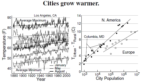
Figure 2.7: At left are historical temperature extremes measured in Los Angeles, California (after Akbari et al. 2001). The six lines show average minimum temperatures (bottom three lines) and maximum temperatures (top three lines) for the months of January (the thin lines), May (the thicker lines), and August (the thickest lines), for the years 1877 to 2005. Temperatures increased over the long term, but the minimum temperatures increased twice as fast. At right, the temperature difference between hot cities and cooler, nearby rural areas defines the urban heat island (UHI). Plotting this difference against the logarithm of city population reveals two straight lines, one for Europe and one for North America (after Oke 1973, 1982). Three data points for Columbia, Maryland (denoted by Xs), plot changes taking place with its population growth over the years. Its trajectory closely follows the North American relation between city size and urban heat island.
Over the last few pages we’ve seen the connections between land-use type, vegetation, and urban climate. Data considered in Figure 2.7 involve citywide averages over much longer time spans, and we find that as cities grow, so do their urban heat islands.
Over the last century, minimum and maximum temperatures increased in Los Angeles, California,[22] where minimum temperatures rose twice as fast as maximum temperatures during the 130-year span shown in the left plot. The straight lines plot statistical fits to the data, giving fitted slopes of minimum temperatures as 0.48, 0.63, and 0.63 F/decade, and maximum temperatures as 0.38, 0.26, and 0.21 F/decade.[23] There are puzzling features, such as the decreasing maximum temperatures in May and August up until about 1910, but, overall, temperatures increased over the last century by about 5-10F.
At least two possible reasons might explain this increase–global warming (discussed in Chapter 3) or the just-discussed urban heat island. Let’s first consider the possibility of local warming due to the urban heat island. As long as 25 years ago scientists knew that larger cities experienced larger urban heat islands,[24] just from looking at the temperature difference between urban and rural weather stations. European cities seemingly defy the laws of thermodynamics, at least as practiced in the United States, but I later show data resolving that peculiarity (see Figure 2.8). The North American data plots one city, Columbia, Maryland, at different population sizes as it grew over the years. With its population, so, too, grew its heat island.[25]
Of course, Los Angeles has changed dramatically over this period. The U.S. Census reports L.A. County populations for 1900, 1950, and 1995, as 170,000, 4.2 million, and 9.3 million, respectively, or about a fifty-fold population increase.
Does this population growth account for the 4C temperature change seen over the last century? Given L.A.’s fifty-fold population increase, the urban heat island regression suggests an expected temperature change of roughly 6C for U.S. cities and 4C for European cities. These numbers fall right within L.A.’s observed temperature increase, so, it seems, we can’t easily dismiss the idea that urban heating explains the increased temperatures of Los Angeles over the last century.
——————————-
[22]The historical temperature plot conceptually follows one by Akbari et al. (2001), but with more extensive Los Angeles historical temperatures provided by the National Oceanic and Atmospheric Administration at www.wrh.noaa.gov/lox/climate/cvc.php.
[23]All of the regressions provide highly significant fits.
[24]The early work on the urban heat island (UHI) and city size originated with Oke (1973), and was further discussed by Oke (1982). Souch and Grimmond (2006) recently published a detailed review of more recent work on UHIs. Here I discount the truly historical 1833 work by Luke Howard!
[25]Can the reason behind the UHI increasing with city size be as simple as a bigger chunk of concrete holds more heat? Some graduate student should find data on the total impervious surface as a function of population size and see if the UHI scales in a correlated way. There’s a large amount of detailed work taking place that gets at the basic science involved; one review of very recent work is by Souch and Grimmond (2006).
