Exploratory visualization in pandas
For exploring data, pandas actually has pretty decent visualization capabilities.
[1]:
%matplotlib inline
import matplotlib.pyplot as plt
[2]:
import pandas as pd
[3]:
import seaborn as sns
[4]:
df = sns.load_dataset('iris')
[5]:
df.head()
[5]:
| sepal_length | sepal_width | petal_length | petal_width | species | |
|---|---|---|---|---|---|
| 0 | 5.1 | 3.5 | 1.4 | 0.2 | setosa |
| 1 | 4.9 | 3.0 | 1.4 | 0.2 | setosa |
| 2 | 4.7 | 3.2 | 1.3 | 0.2 | setosa |
| 3 | 4.6 | 3.1 | 1.5 | 0.2 | setosa |
| 4 | 5.0 | 3.6 | 1.4 | 0.2 | setosa |
[6]:
pd.options.plotting.backend = 'matplotlib'
[7]:
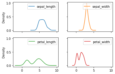
df.plot.kde(layout = (2,2), subplots = True, sharey=True)
pass
[8]:
from pandas.plotting import boxplot_frame_groupby
[9]:
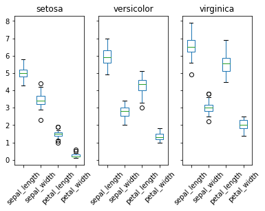
boxplot_frame_groupby(df.groupby('species'), layout=(1,3), grid=False, rot=45);
[10]:
pd.options.plotting.backend = 'plotly'
[11]:
df.plot.scatter(
    x='sepal_length',
    y='petal_length',
    color='species',
    marginal_y="violin",
    marginal_x="box",
    trendline="ols"
)
Using pandas-bokeh
[12]:
pd.options.plotting.backend = 'pandas_bokeh'
import pandas_bokeh
from bokeh.io import output_notebook
[13]:
output_notebook()
Example from official docs: pandas-bokeh
[14]:
df_mapplot = pd.read_csv(r"https://bit.ly/325W5Yy")
df_mapplot["size"] = df_mapplot["pop_max"] / 1000000
df_mapplot.plot_bokeh.map(
    x="longitude",
    y="latitude",
    hovertool_string="<h2> @{name} </h2> <h3> Population: @{pop_max} </h3>",
    tile_provider='STAMEN_TERRAIN_RETINA',
    size="size",
    figsize=(900, 600),
    title="World cities with more than 1.000.000 inhabitants")
[14]:
Figure(
id = '1002', …)
More controlled visualizations
Grammar of graphics in Python
If you love ggplot2 and just want to stick with it.
[15]:
import warnings
from plotnine import *
from plotnine.exceptions import PlotnineWarning
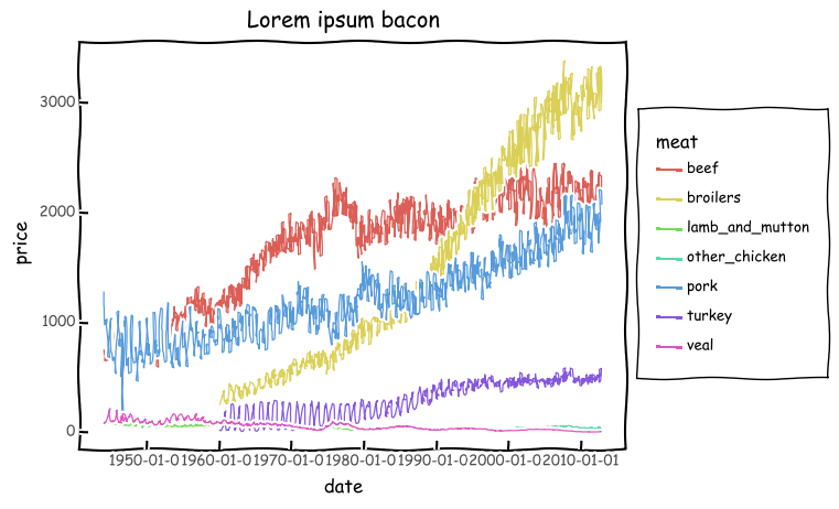
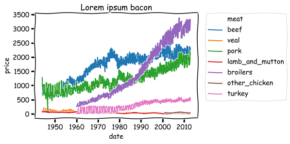
from plotnine.data import meat
warnings.simplefilter('ignore', FutureWarning)
warnings.simplefilter('ignore', PlotnineWarning)
[16]:
meat.sample(3)
[16]:
| date | beef | veal | pork | lamb_and_mutton | broilers | other_chicken | turkey | |
|---|---|---|---|---|---|---|---|---|
| 321 | 1970-10-01 | 1913.0 | 49.0 | 1278.0 | 48.0 | 633.4 | NaN | 276.9 |
| 720 | 2004-01-01 | 1926.0 | 16.0 | 1758.0 | 15.5 | 2823.6 | 39.2 | 440.0 |
| 566 | 1991-03-01 | 1720.0 | 25.0 | 1300.0 | 36.0 | 1530.9 | NaN | 329.7 |
[17]:
df = pd.melt(meat, id_vars=['date'],
             var_name='meat',
             value_name='price')
[18]:
p = (
    ggplot(df, aes(x='date', y='price', color='meat')) +
    geom_line() +
    theme_xkcd() +
    labs(title="Lorem ipsum bacon")
)
[19]:
p.draw();
[20]:
p.save('meat.png')
[21]:
from IPython.display import Image
[22]:
Image('meat.png')
[22]:

Similar plot in seaborn
[23]:
with plt.xkcd():
    g = sns.lineplot(data=df, x='date', y='price', hue='meat')
    g.set_title('Lorem ipsum bacon')
    plt.legend(bbox_to_anchor=(1.05, 1), loc=2, borderaxespad=0.)
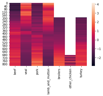
Show as heatmap
[24]:
(
    sns.heatmap(
        meat.select_dtypes('number').
        apply(lambda x: (x-x.mean())/x.std(), axis=0))
)
pass
[ ]: