Unsupervised Learning
[1]:
%matplotlib inline
import matplotlib.pyplot as plt
[2]:
import numpy as np
import pandas as pd
Data
[3]:
url = (
    'http://biostat.mc.vanderbilt.edu/'
    'wiki/pub/Main/DataSets/titanic3.xls'
)
[4]:
df = pd.read_excel(url)
df_orig = df.copy()
[5]:
! python3 -m pip install --quiet category_encoders missingno yellowbrick
[6]:
import category_encoders as ce
[7]:
from sklearn.experimental import enable_iterative_imputer
from sklearn.impute import IterativeImputer
[8]:
from sklearn.preprocessing import StandardScaler
Preprocess data
[9]:
df.isnull().shape
[9]:
(1309, 14)
[10]:
import missingno as mn
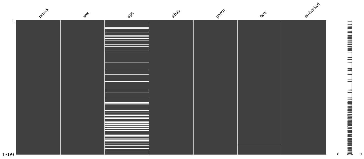
Drop leaky or low-information variables
[11]:
df = df.drop(columns = ['survived', 'name', 'ticket', 'boat', 'body', 'cabin', 'home.dest'])
[12]:
mn.matrix(df);
[13]:
df.select_dtypes('object')
[13]:
| sex | embarked | |
|---|---|---|
| 0 | female | S |
| 1 | male | S |
| 2 | female | S |
| 3 | male | S |
| 4 | female | S |
| ... | ... | ... |
| 1304 | female | C |
| 1305 | female | C |
| 1306 | male | C |
| 1307 | male | C |
| 1308 | male | S |
1309 rows × 2 columns
[14]:
import warnings
warnings.simplefilter('ignore', FutureWarning)
Convert categorical values
[15]:
df = pd.get_dummies(df, drop_first=True)
[16]:
df.columns
[16]:
Index(['pclass', 'age', 'sibsp', 'parch', 'fare', 'sex_male', 'embarked_Q',
       'embarked_S'],
      dtype='object')
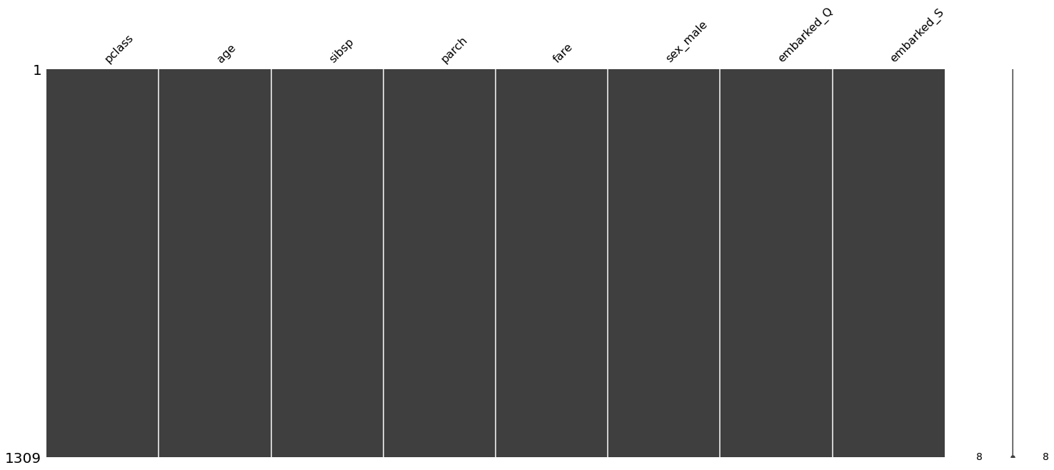
Impute missing values
[17]:
imputer = IterativeImputer()
[18]:
df.loc[:, :] = imputer.fit_transform(df)
[19]:
df.head()
[19]:
| pclass | age | sibsp | parch | fare | sex_male | embarked_Q | embarked_S | |
|---|---|---|---|---|---|---|---|---|
| 0 | 1.0 | 29.0000 | 0.0 | 0.0 | 211.3375 | 0.0 | 0.0 | 1.0 |
| 1 | 1.0 | 0.9167 | 1.0 | 2.0 | 151.5500 | 1.0 | 0.0 | 1.0 |
| 2 | 1.0 | 2.0000 | 1.0 | 2.0 | 151.5500 | 0.0 | 0.0 | 1.0 |
| 3 | 1.0 | 30.0000 | 1.0 | 2.0 | 151.5500 | 1.0 | 0.0 | 1.0 |
| 4 | 1.0 | 25.0000 | 1.0 | 2.0 | 151.5500 | 0.0 | 0.0 | 1.0 |
[20]:
df.isnull().sum().sum()
[20]:
0
[21]:
mn.matrix(df);
[22]:
scaler = StandardScaler()
[23]:
df.loc[:, :] = scaler.fit_transform(df)
[24]:
df.head()
[24]:
| pclass | age | sibsp | parch | fare | sex_male | embarked_Q | embarked_S | |
|---|---|---|---|---|---|---|---|---|
| 0 | -1.546098 | -0.032047 | -0.479087 | -0.445000 | 3.442383 | -1.344995 | -0.32204 | 0.657394 |
| 1 | -1.546098 | -2.134080 | 0.481288 | 1.866526 | 2.286588 | 0.743497 | -0.32204 | 0.657394 |
| 2 | -1.546098 | -2.052995 | 0.481288 | 1.866526 | 2.286588 | -1.344995 | -0.32204 | 0.657394 |
| 3 | -1.546098 | 0.042803 | 0.481288 | 1.866526 | 2.286588 | 0.743497 | -0.32204 | 0.657394 |
| 4 | -1.546098 | -0.331447 | 0.481288 | 1.866526 | 2.286588 | -1.344995 | -0.32204 | 0.657394 |
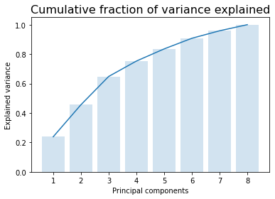
Dimension reduction
PCA
If your knowledge of PCA is fading, see the notebook B03A_PCA.ipynb
[25]:
from sklearn.decomposition import PCA
[26]:
pca = PCA()
[27]:
X = pca.fit_transform(df)
[28]:
y = np.cumsum(pca.explained_variance_ratio_)
x = np.arange(1, len(y)+1)
plt.bar(x, y, alpha = 0.2)
plt.plot(x, y)
plt.xlabel('Principal components')
plt.ylabel('Explained variance')
plt.title('Cumulative fraction of variance explained', fontsize=16);
[29]:
X.shape
[29]:
(1309, 8)
[30]:
df_orig.survived
[30]:
0       1
1       1
2       0
3       0
4       0
       ..
1304    0
1305    0
1306    0
1307    0
1308    0
Name: survived, Length: 1309, dtype: int64
[31]:
df_X = pd.DataFrame(X[:, :4], columns = [f'PC{i}' for i in range(1, 5)])
df_X['survived'] = df_orig.survived
[32]:
import seaborn as sns
[33]:
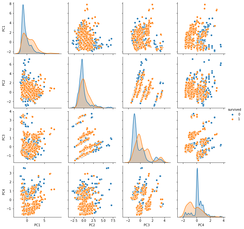
sns.pairplot(df_X, hue='survived');
[34]:
df.columns
[34]:
Index(['pclass', 'age', 'sibsp', 'parch', 'fare', 'sex_male', 'embarked_Q',
       'embarked_S'],
      dtype='object')
[35]:
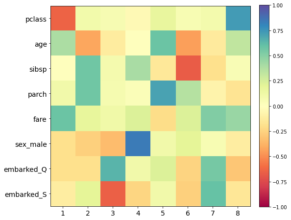
plt.figure(figsize=(8,8))
plt.imshow(pca.components_.T, cmap='Spectral', vmin=-1, vmax=1)
plt.colorbar(fraction=0.046, pad=0.04)
plt.yticks(range(len(df.columns)), df.columns, fontsize=14);
plt.xticks(range(len(df.columns)), 1+np.arange(len(df.columns)), fontsize=14);
[36]:
from yellowbrick.features import PCA as PCA_
[37]:
plt.rcParams['font.size'] = 14
pca_viz = PCA_(scale=True, proj_features=True)
pca_viz.fit_transform(df, df_orig.survived)
pca_viz.show();
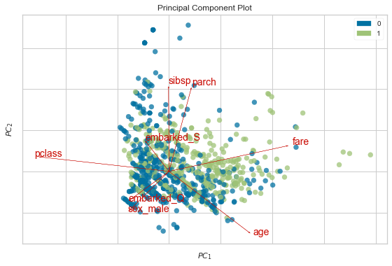
Interpreting the biplot
Bi = PCA plot + loadings plot
Each PC is just a linear combination of the original variables.
The coefficients \(\alpha_i\) are known as loadings for each PC. This is stored in the components_ attribute of the sklearn PCA instance. The loadings plot shows the contributions of the original features onto the PC axes. Here we show how pclass and page are projected as arrows onto the first 2 PC axes to make the process explicit.
Arrows that point in the same direction indicate that the corresponding features are positively correlated
Arrows that point in the opposite direction that the corresponding features are negatively correlated
Arrows that are orthogonal that the corresponding features are uncorrelated
[38]:
loadings = pd.DataFrame(pca.components_.T, columns = df.columns)
loadings
[38]:
| pclass | age | sibsp | parch | fare | sex_male | embarked_Q | embarked_S | |
|---|---|---|---|---|---|---|---|---|
| 0 | -0.635912 | 0.097772 | 0.068619 | -0.033886 | 0.171127 | 0.061837 | 0.091351 | 0.733993 |
| 1 | 0.396012 | -0.415742 | -0.121860 | -0.004035 | 0.579482 | -0.441761 | -0.130143 | 0.327990 |
| 2 | -0.002109 | 0.570101 | 0.082058 | 0.405007 | -0.146939 | -0.667134 | -0.187980 | 0.047117 |
| 3 | 0.108994 | 0.562594 | 0.073326 | 0.037057 | 0.703756 | 0.366590 | -0.077139 | -0.171017 |
| 4 | 0.582783 | 0.173223 | 0.117102 | 0.228776 | -0.207883 | 0.230598 | 0.518714 | 0.445929 |
| 5 | -0.193497 | -0.262061 | -0.340069 | 0.843517 | 0.106354 | 0.198993 | 0.059173 | -0.110924 |
| 6 | -0.192757 | -0.194293 | 0.641248 | 0.106013 | 0.229891 | -0.248139 | 0.547727 | -0.297035 |
| 7 | -0.112580 | 0.199099 | -0.654043 | -0.241523 | 0.103325 | -0.259269 | 0.600716 | -0.151074 |
[39]:
x1, y1 = loadings.pclass[:2]
x2, y2 = loadings.age[:2]
[40]:
plt.arrow(0,0,x1,y1, head_width=0.02)
plt.arrow(0,0,x2,y2, head_width=0.02)
plt.text(x1 + 0.05, y1, loadings.columns[0])
plt.text(x2 - 0.05, y2, loadings.columns[1])
plt.tight_layout()
We expect these to be negatively correlated since they point in approximately opposite directions.
[41]:
df.corr().iloc[:2, :2]
[41]:
| pclass | age | |
|---|---|---|
| pclass | 1.000000 | -0.439092 |
| age | -0.439092 | 1.000000 |
Limitations of PCA
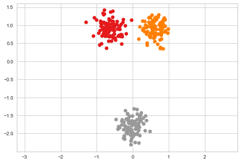
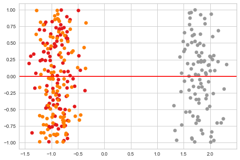
We will project a 2-d data set onto 1-d to see one limitation of PCA. This provides motivation for learning non-linear methods of dimension reduction.
[42]:
x1 = np.random.multivariate_normal([-3,3], np.eye(2), 100)
x2 = np.random.multivariate_normal([3,3], np.eye(2), 100)
x3 = np.random.multivariate_normal([0,-10], np.eye(2), 100)
xs = np.r_[x1, x2, x3]
xs = (xs - xs.mean(0))/xs.std()
zs = np.r_[np.zeros(100), np.ones(100), 2*np.ones(100)]
[43]:
plt.scatter(xs[:, 0], xs[:, 1], c=zs, cmap='Set1')
plt.axis('equal')
pass
[44]:
pca = PCA(n_components=1)
[45]:
ys = pca.fit_transform(xs)
[46]:
plt.scatter(ys[:, 0], np.random.uniform(-1, 1, len(ys)), c=zs, cmap='Set1')
plt.axhline(0, c='red')
pass
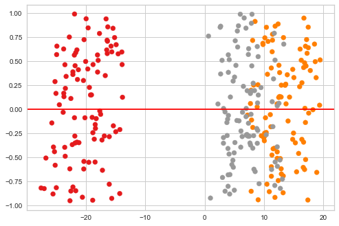
T-SNE preserves locality
The t-SNE algorithm was designed to preserve local distances between points in the original space, as we saw in the example above. This means that t-SNE is particularly effective at preserving clusters in the original space. The full t-SNE algorithm is quite complex, so we just sketch the ideas here.
For more details, see the original series of papers and this Python tutorial. The algorithm is also clearly laid out in the fairly comprehensive tutorial.
Outline of t-SNE
t-SNE is similar in outline to MDS, with two main differences - “distances” are baased on probabilistic concepts and depend on the local neighborhood of the point.
Original space
Find the conditinoal similarity between points in the original space based on a Gaussian kernel
where
Symmetize the conditional similarity (this is necessary becasue each kernel has its own variance)
This gives a similarity matrix \(p_{ij}\) that is fixed
Notes
In t-SNE, the variance of the Gaussian kernel depensd on the point \(x_i\). Intuitively, we want the variance to be small if \(x_i\) is in a locally desnse region, and to be large if \(x_i\) is in a locally sparse region. This is done by an iteratvie algorithm that depends on a user-defined variable called perplexity. Roughly, perplexity determines the number of meaningful neighbors each point should have.
Map space
Find the conditional similarity between points in the map space based on a Cauchy kernel
where
This gives a similarity matrix \(q_{ij}\) that depends on the points in the map space that we can vary
Optimization
Minimize the Kullback-Leibler divergence between \(p_{ij}\) and \(q_{ij}\)
Normal and Cauhcy distributions
The Cauchy has much fatter tails than the normal distribution. This means that two points that are widely separated in the original space would be pushed much further apart in the map space.
[47]:
! python3 -m pip install --quiet fitsne
[48]:
import fitsne
[49]:
ys = fitsne.FItSNE(xs)
[50]:
plt.scatter(ys[:, 0], np.random.uniform(-1, 1, len(ys)), c=zs, cmap='Set1')
plt.axhline(0, c='red')
pass
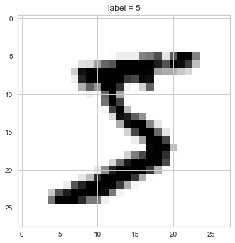
Illustrating with MNIST digits
[51]:
from sklearn.datasets import fetch_openml

X, y = fetch_openml('mnist_784', version=1, return_X_y=True)
plt.imshow(X[0].reshape((28,28)), cmap='binary')
plt.title(f'label = {y[0]}');
[52]:
%%capture
sc = plt.scatter(np.arange(10), np.arange(10), c=np.arange(10), cmap='tab10')
[53]:
%%time
pca = PCA(n_components=2)
X_pca = pca.fit_transform(X)
CPU times: user 11.3 s, sys: 2.27 s, total: 13.6 s
Wall time: 1.91 s
[63]:
import warnings
warnings.simplefilter('ignore', UserWarning)
[65]:
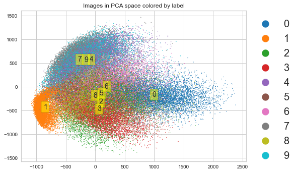
plt.scatter(X_pca[:, 0], X_pca[:, 1], s=1,
            c=y.astype('int'), cmap='tab10')
plt.title('Images in PCA space colored by label')
for i in range(10):
    idx = y == i
    μ = np.mean(X_pca[y == i], axis=0)
    plt.text(*μ, str(i), va='center', ha='center',
             bbox=dict(facecolor='yellow', alpha=0.5))
plt.legend(*sc.legend_elements(),
           bbox_to_anchor=(1,1),
           fontsize=20,
           markerscale=2);
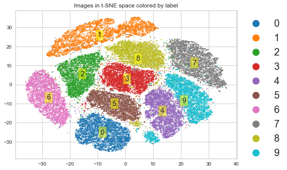
t-SNE preserves local structure
[55]:
X.shape
[55]:
(70000, 784)
[56]:
import fitsne
[57]:
%%time
X = X.copy(order='C')
X_tsne = fitsne.FItSNE(X)
CPU times: user 13min 3s, sys: 7.3 s, total: 13min 10s
Wall time: 2min 10s
[64]:
plt.scatter(X_tsne[:, 0], X_tsne[:, 1], s=1,
            c=y.astype('int'), cmap='tab10')
plt.title('Images in t-SNE space colored by label')
for i in range(10):
    idx = y == i
    μ = np.mean(X_tsne[y == i], axis=0)
    plt.text(*μ, str(i), va='center', ha='center',
             bbox=dict(facecolor='yellow', alpha=0.5))
plt.legend(*sc.legend_elements(),
           bbox_to_anchor=(1,1),
           fontsize=20,
           markerscale=2);
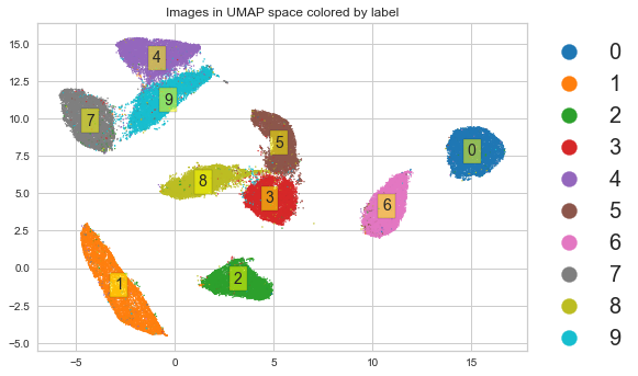
UMAP preserves local and (maybe) global structure
Normally I would refer you to the original paper. But the original paper is hard to read unless you have graduate training in pure mathematics, so visit this tutorial instead.
[59]:
import umap
[60]:
%%time
X_umap = umap.UMAP().fit_transform(X)
CPU times: user 3min 38s, sys: 5.51 s, total: 3min 44s
Wall time: 1min 12s
[61]:
y = y.astype('int')
[62]:
plt.scatter(X_umap[:, 0], X_umap[:, 1], s=1,
            c=y, cmap='tab10')
plt.title('Images in UMAP space colored by label')
for i in range(10):
    idx = y == i
    μ = np.mean(X_umap[y == i], axis=0)
    plt.text(*μ, str(i), va='center', ha='center',
             bbox=dict(facecolor='yellow', alpha=0.5))
plt.legend(*sc.legend_elements(),
           bbox_to_anchor=(1,1),
           fontsize=20,
           markerscale=2);